
Cleo + Coco Body Care
Project Description
Cleo+Coco — Wellness Brand Transformation, Packaging & E-commerce Design
A full-scale brand transformation for Cleo+Coco — repositioning a niche natural deodorant into a premium, retail-ready wellness brand.
This project brought together brand strategy, identity, packaging, content and e-commerce design to create a cohesive system that could scale across direct-to-consumer and retail environments — driving significant growth in both channels.
Services Provided
– Brand Strategy
– Identity Design
– Packaging Design
– Label Design
– Website Design
– Illustration
Client Location
— New York City
— United States
Market Reach
— Global
Retail Partners
— Erewhon
— Target
— Goop
— QVC
— Beauty Heroes
— Thrive Market
— Amazon
— Rite Aid
Project Links


The Opportunity
When Cleo+Coco approached us, the product was already working.
The formulations were strong, the early audience was loyal, and the brand had clear potential within the fast-growing clean beauty space.
But the brand itself wasn’t keeping up.
It lacked:
a cohesive identity
clarity on shelf
confidence in its positioning
a system that could scale across retail and digital
The opportunity was not simply to redesign — but to reposition the brand for growth.
Repositioning from Niche to Mainstream
Our strategic shift was simple, but powerful:
Make natural feel normal.
Rather than positioning Cleo+Coco as a niche “natural alternative,” we reframed it as a modern personal care brand — one that delivers high-performance products without compromise.
This repositioning allowed the brand to:
move beyond the “eco niche”
appeal to a broader, design-aware audience
compete confidently in both boutique and mainstream retail
maintain its clean ingredient integrity while elevating perception

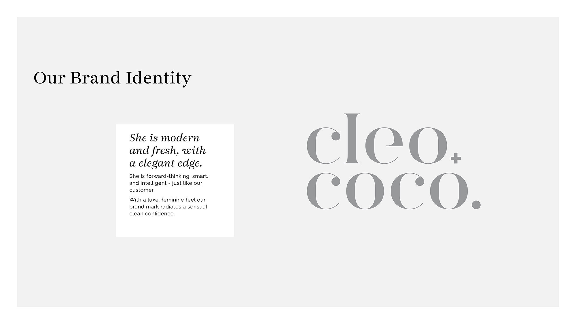
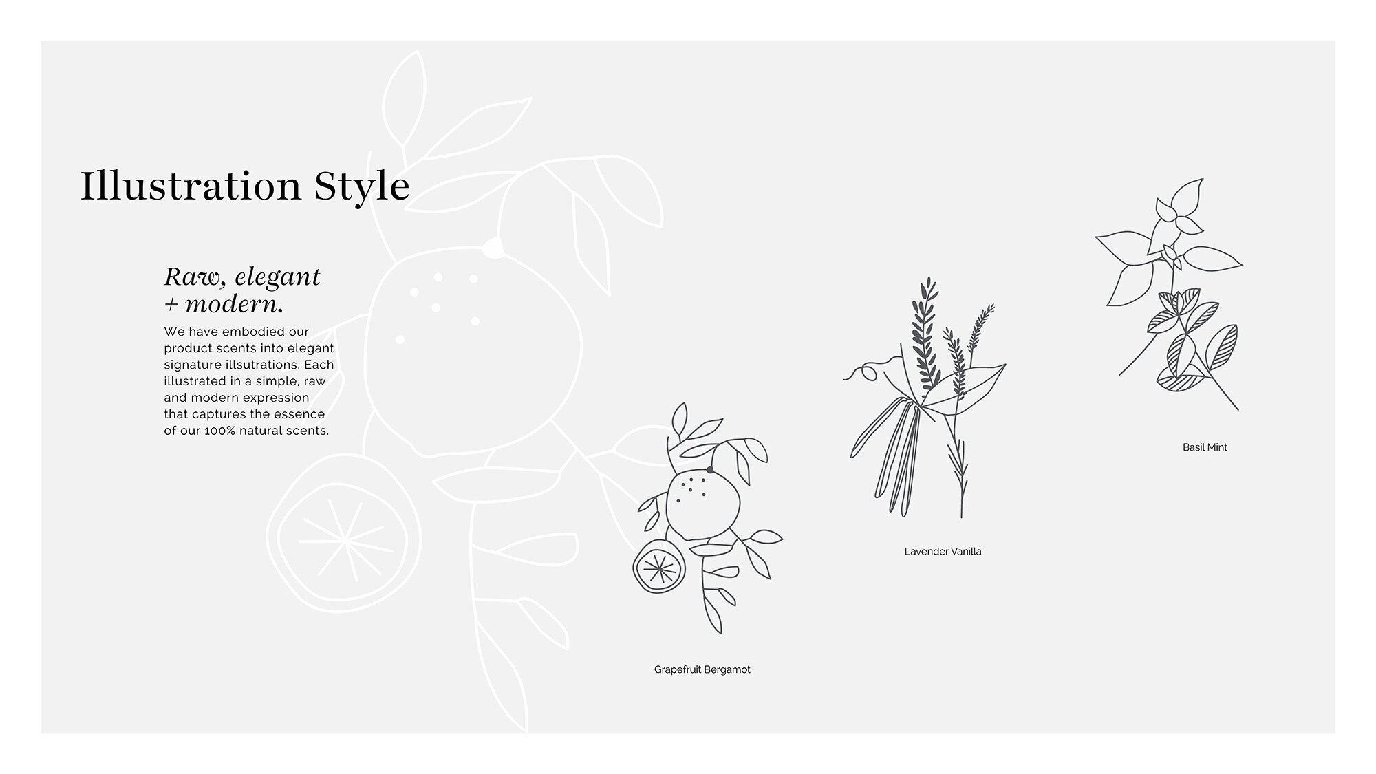
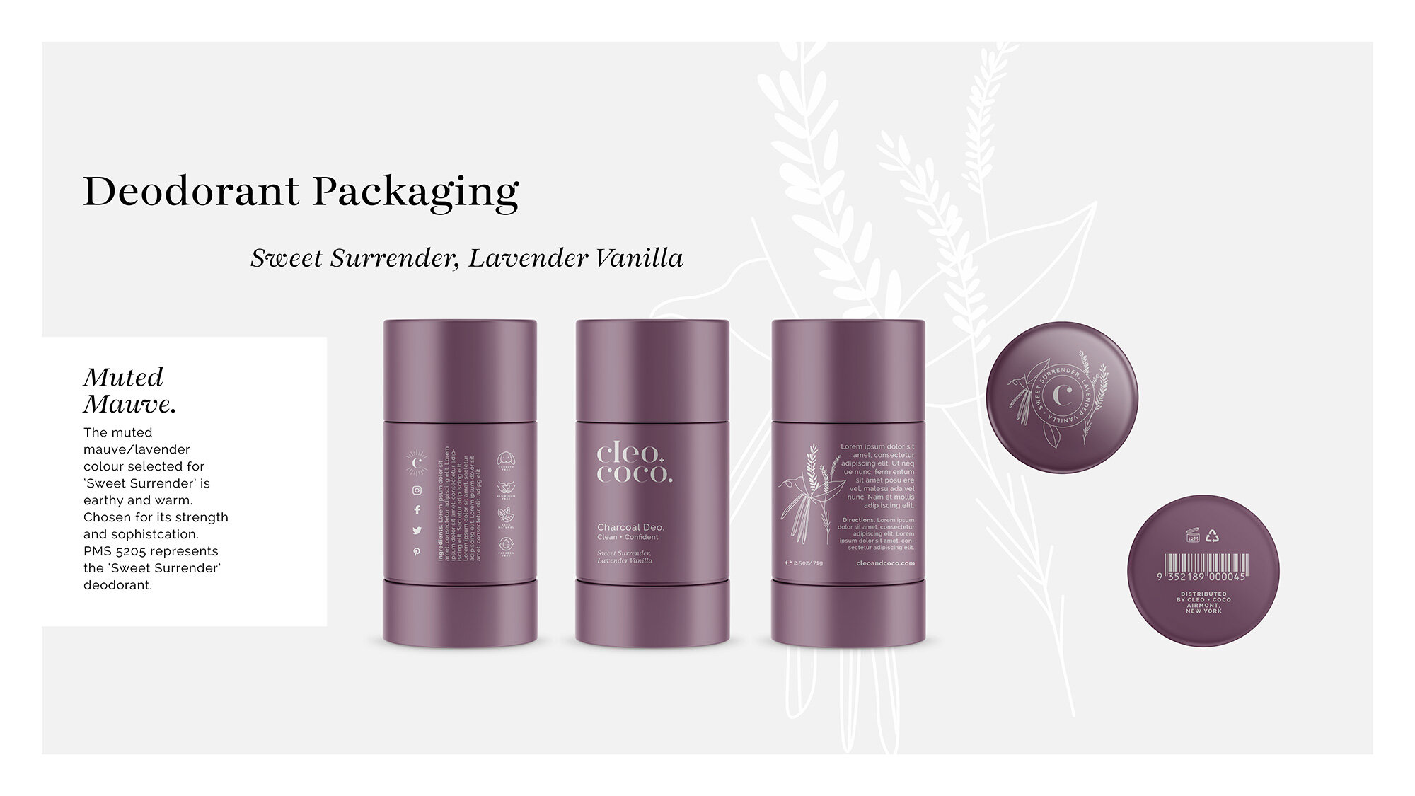
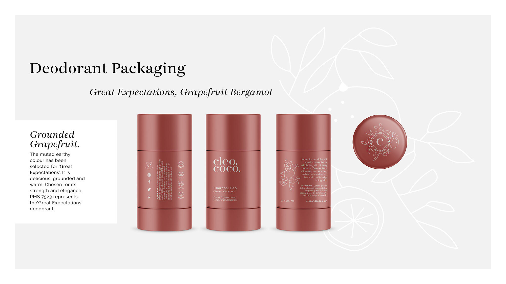
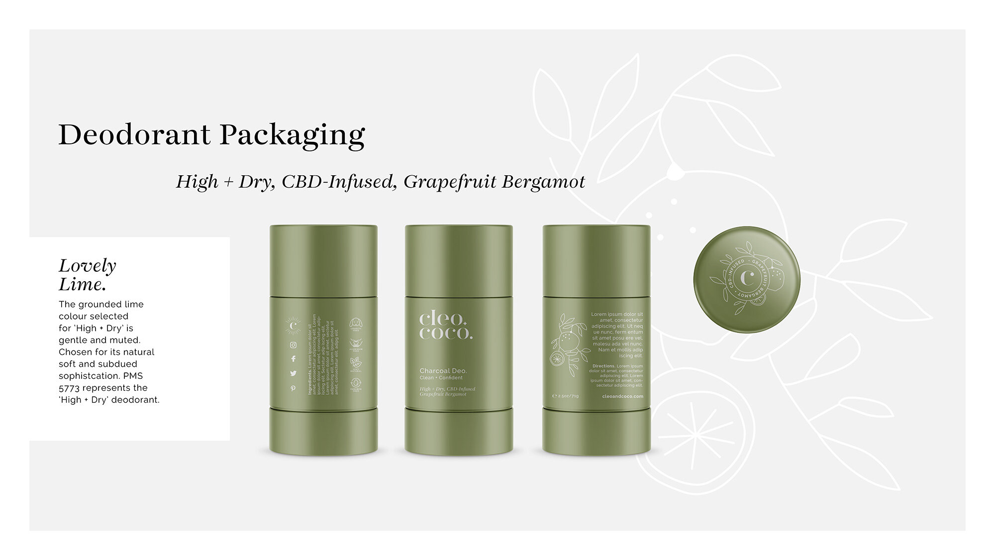
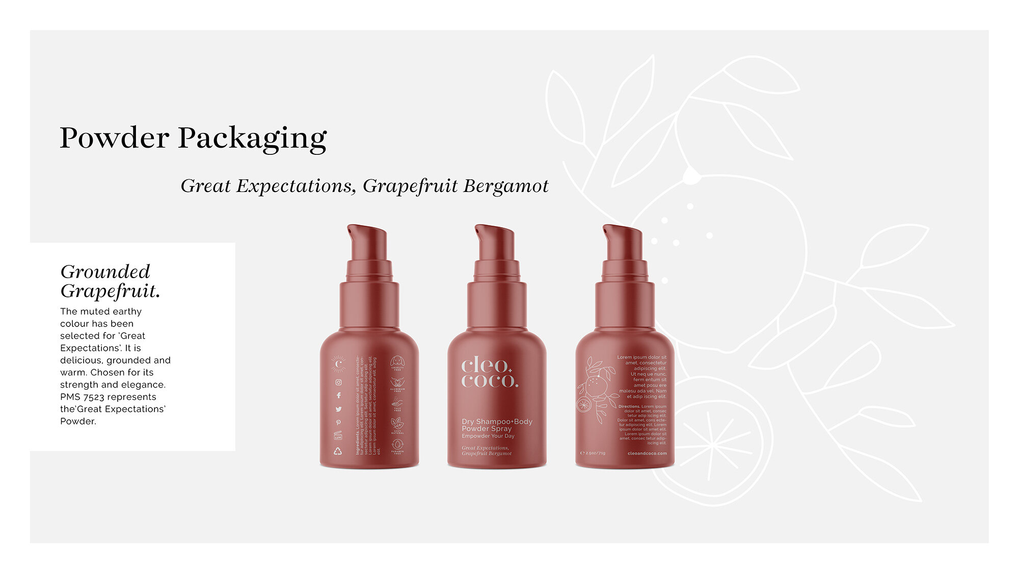
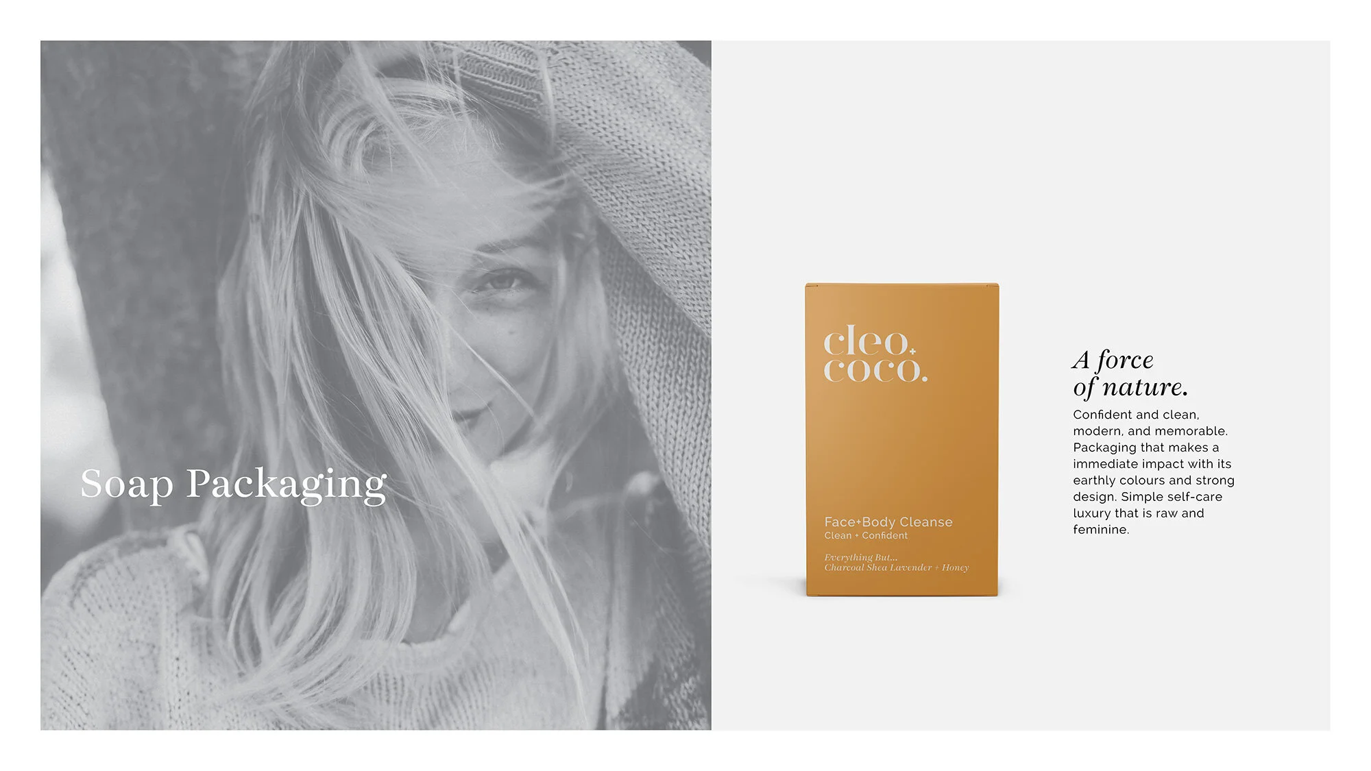
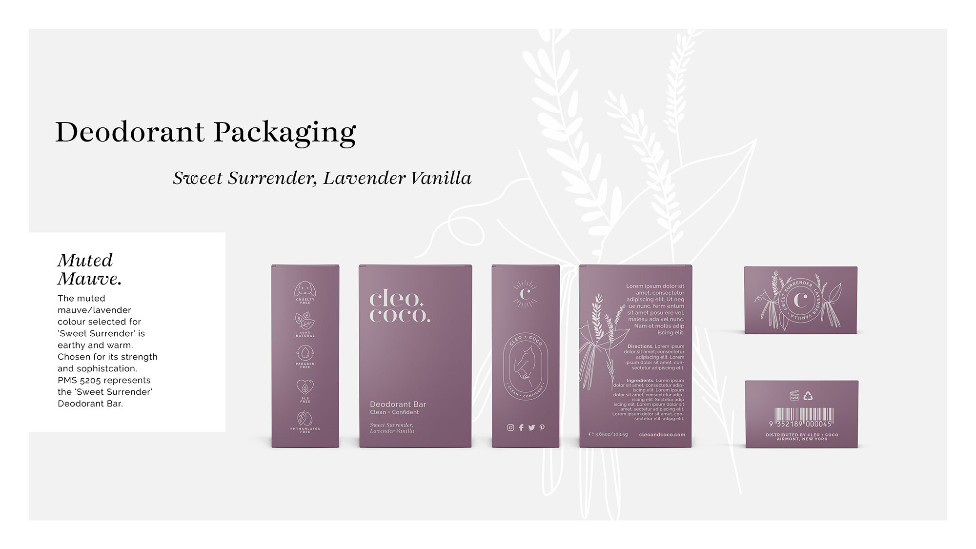
Brand Identity & Packaging System
The identity was designed to be clear, confident and instantly recognisable.
Key elements of the system include:
a bold, modern wordmark
assertive, highly legible typography
a colour architecture organised by scent
hand-drawn ingredient illustrations to add warmth and provenance
a clear icon system to communicate key product benefits quickly
The packaging system was built with retail in mind — ensuring:
strong shelf presence
fast product navigation
immediate communication of benefits
consistency across a growing product range
This balance of clarity and character allowed the brand to stand out without overwhelming.
E-commerce & Digital Experience
We extended the brand system into a custom Shopify experience — ensuring the clarity achieved on shelf translated seamlessly online.
The digital experience focused on:
intuitive product architecture
clear scent navigation
consistent tone of voice
alignment across product pages, campaigns and social content
This created a unified brand experience — where every touchpoint reinforced the same idea.


From Brand to Growth Platform
The impact of the transformation was immediate.
The rebrand didn’t just change how Cleo+Coco looked — it changed how it performed.
Retailers who had previously hesitated began engaging
The brand moved into national and international retail channels
Direct-to-consumer sales strengthened through clearer positioning and messaging
The first QVC airing sold out in 10 minutes — a clear signal that the brand was now connecting at scale.
The Outcome
Cleo+Coco is now positioned as a leading clean body care brand within the US market.
The brand system supports:
retail expansion across 100+ stockists
strong direct-to-consumer growth
product line extensions
ongoing brand evolution without losing consistency
Key milestones include:
10× sales growth in 2020, surpassing $1M revenue
revenue doubling again in 2021
retail presence across platforms including Goop, Target, Neiman Marcus and Amazon
nationwide Whole Foods Market launch (2025)


Why It Worked
The success of Cleo+Coco comes down to a simple principle:
Clarity creates confidence.
By aligning strategy, identity, packaging and digital experience, the brand became:
easier to understand
easier to trust
easier to buy
The system balances:
sensory appeal (colour, illustration, texture)
functional clarity (icons, hierarchy, typography)
This allows the brand to perform equally well:
on shelf
online
across marketing and campaigns
A Living Brand System
Since the initial rebrand, Cleo+Coco has continued to evolve — including a recent packaging and digital refinement using more sustainable materials and elevated finishes.
The strength of the original system is that it allows for this evolution without losing recognition.
This project demonstrates our approach to building brands as living systems — designed not just for launch, but for long-term growth.