Zaaina Conscious Beauty


Project Description
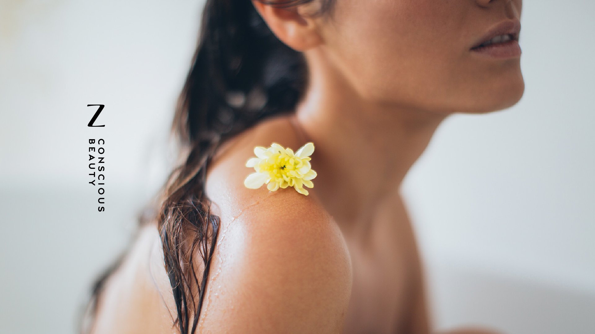
Zaaina — Global Skincare Branding & Packaging Design
A heritage-rich clean beauty brand, reimagined for modern retail and global growth.
We partnered with US-based skincare brand Zaaina to reposition and redesign the brand — creating a refined identity and packaging system that honours its origins while supporting expansion across digital and physical retail channels.
Zaaina was founded on deeply personal roots — inspired by traditional beauty rituals and natural, handcrafted formulations passed down through generations.
While the product was strong, the brand lacked the clarity and cohesion needed to compete in an increasingly sophisticated clean beauty market.
The opportunity was to:
elevate the brand without losing its soul
improve clarity across a growing product range
create a system that could scale across retail and eCommerce
position the brand for premium, global distribution
Services Provided
– Brand Strategy & Positioning
– Visual Identity System
– Packaging Design System
– Illustration & Art Direction
– Brand Guidelines
– eCommerce Toolkit
Client Location
— United States
Market Reach
— Global
Retail Partners
— Costco
— Uncommongoods
— 1800flowers
— West Elm
— Etsy
— Amazon
Project Links
– www.zaaina.com
– Instagram
Repositioning the Brand
Our strategic approach centred on a simple but powerful idea:
performance with provenance.
Rather than leaning into generic “natural” aesthetics, we reframed Zaaina as a brand defined by:
handcrafted quality
ingredient integrity
quiet, confident luxury
This repositioning allowed the brand to move from niche to mainstream premium — without losing its authenticity.

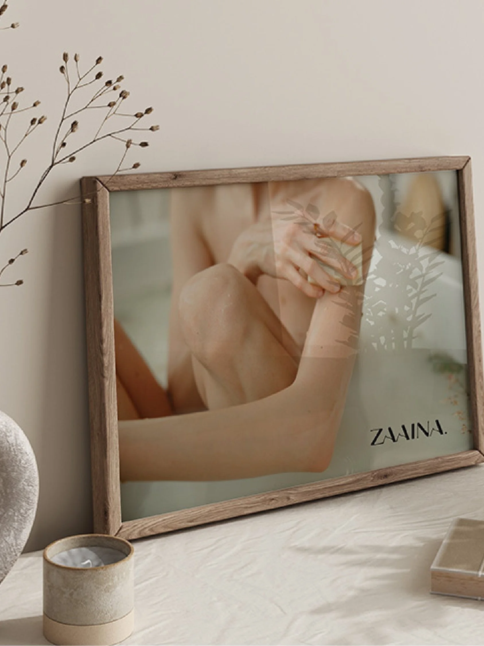

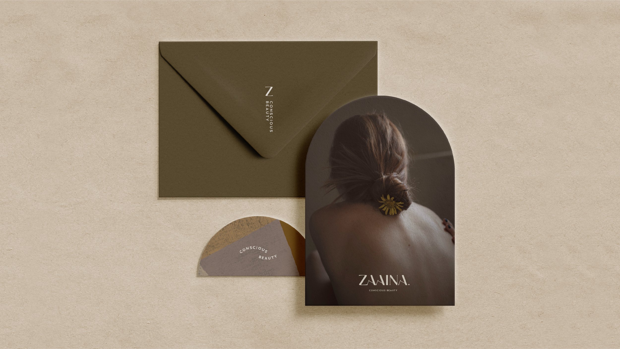
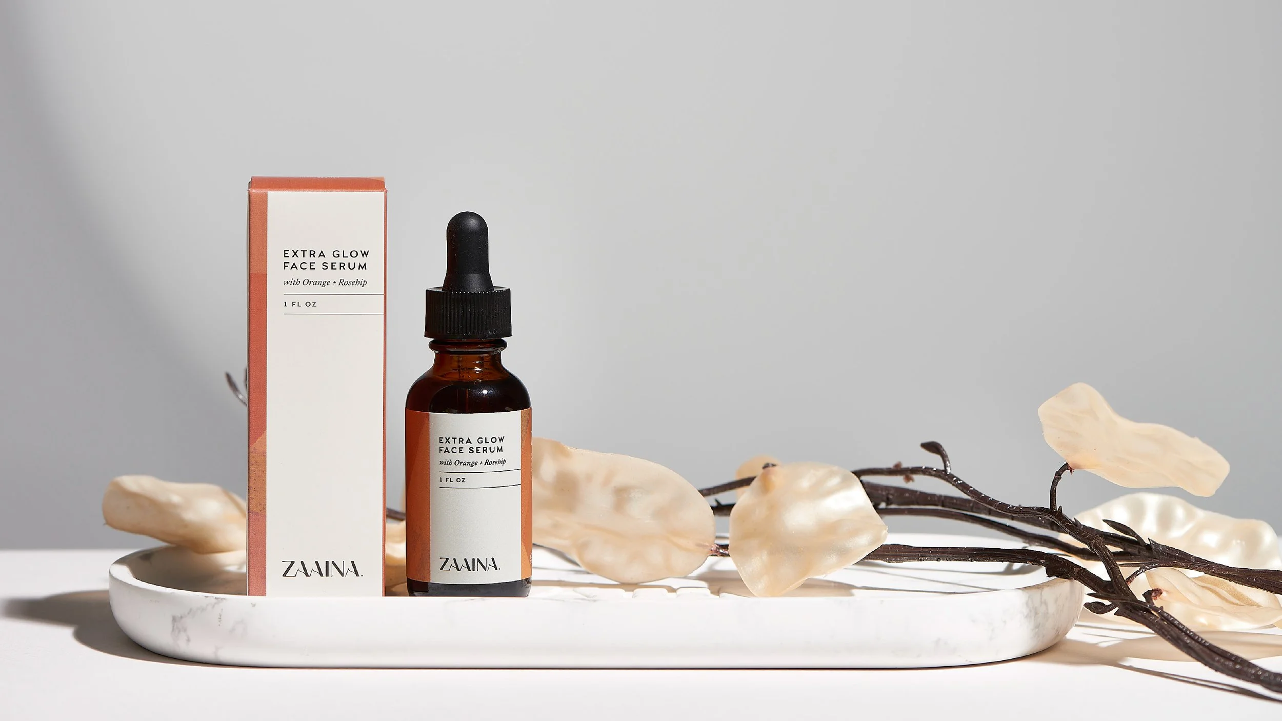
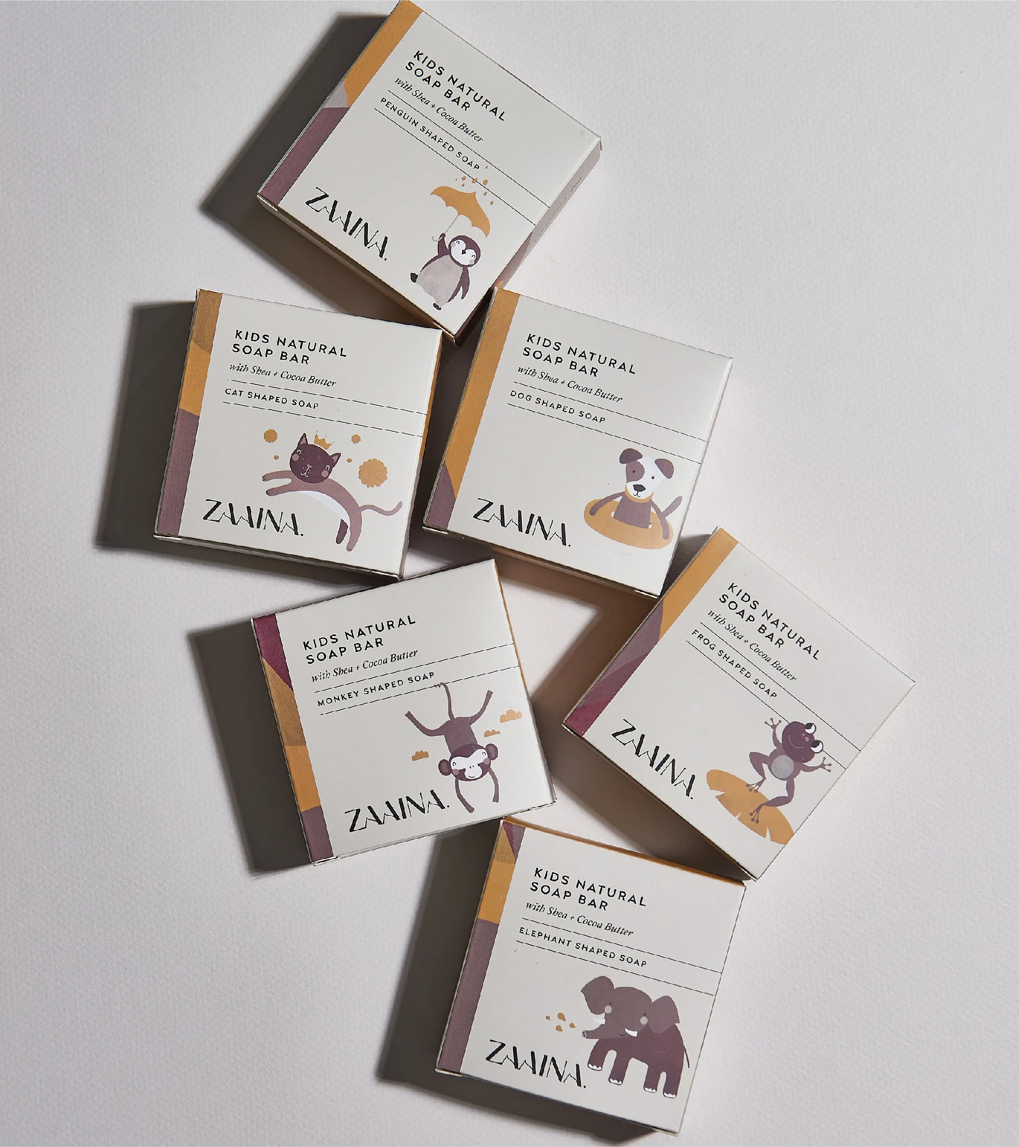
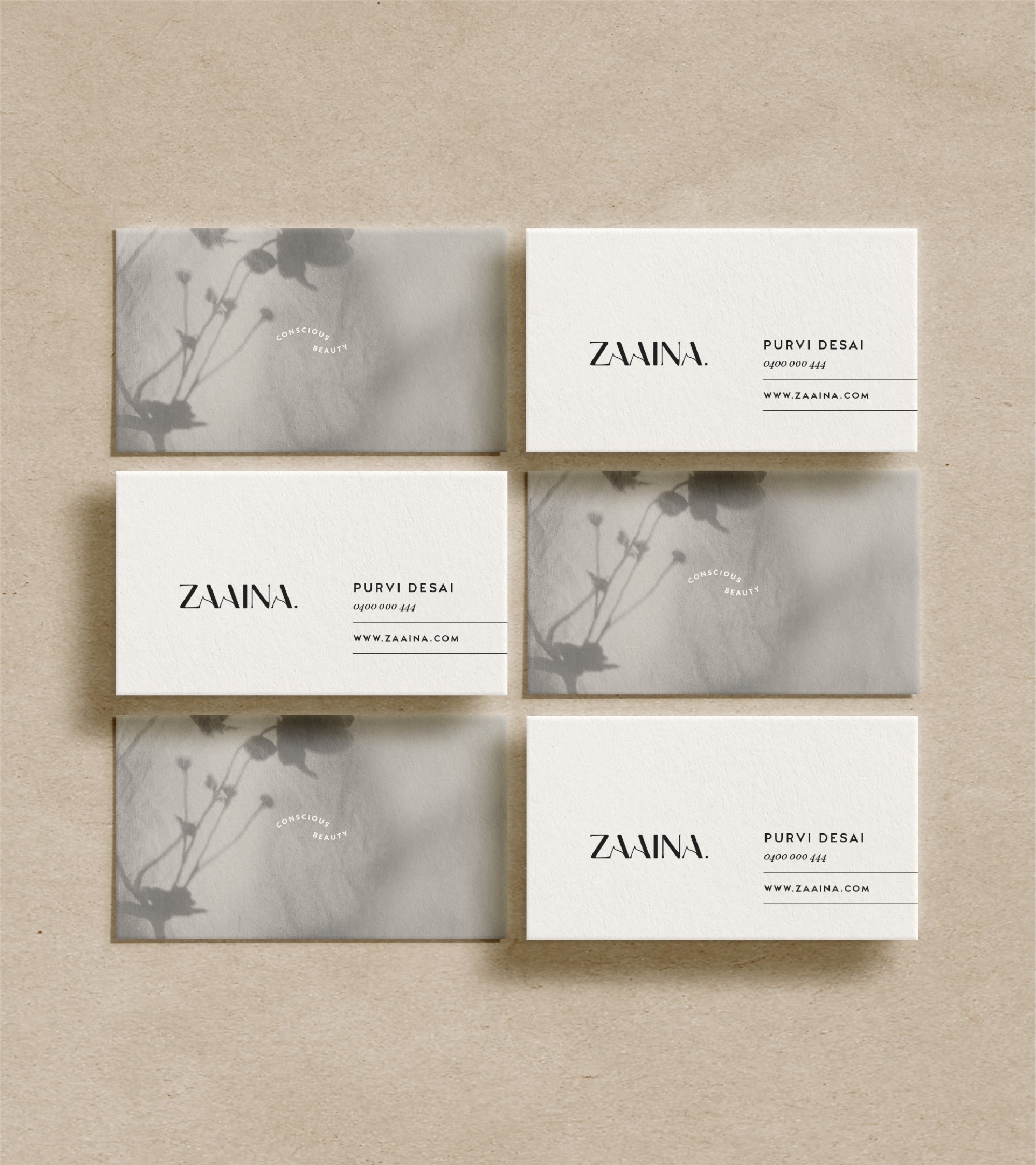
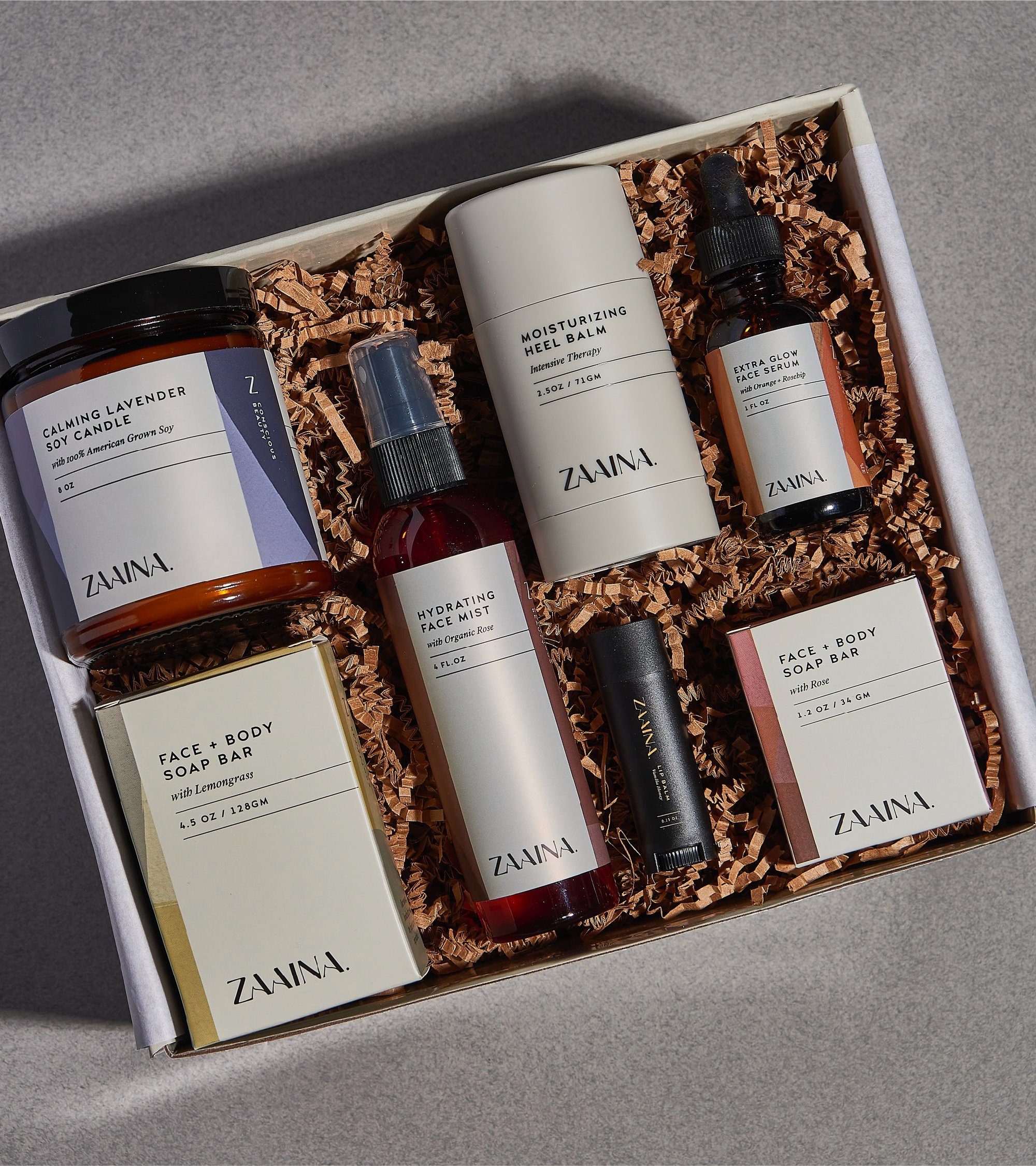
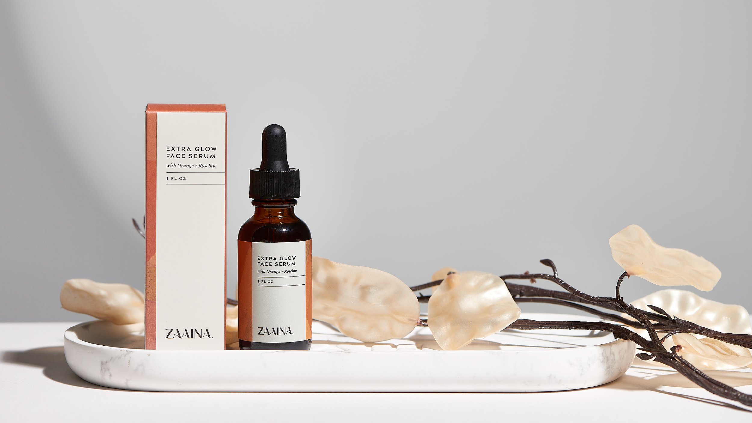
Identity & Packaging System
The visual identity was designed with restraint — allowing the product and story to breathe.
We developed:
a refined, modern wordmark
a minimalist typographic system
a flexible colour architecture across SKUs
a cohesive packaging framework for a growing range
At the heart of the system are hand-illustrated artworks — deeply textural, expressive and rooted in heritage.
These illustrations:
reference botanical ingredients and craft
introduce warmth and tactility
differentiate the brand in a crowded category
The balance of minimal structure and rich texture creates a brand that feels both elevated and human.


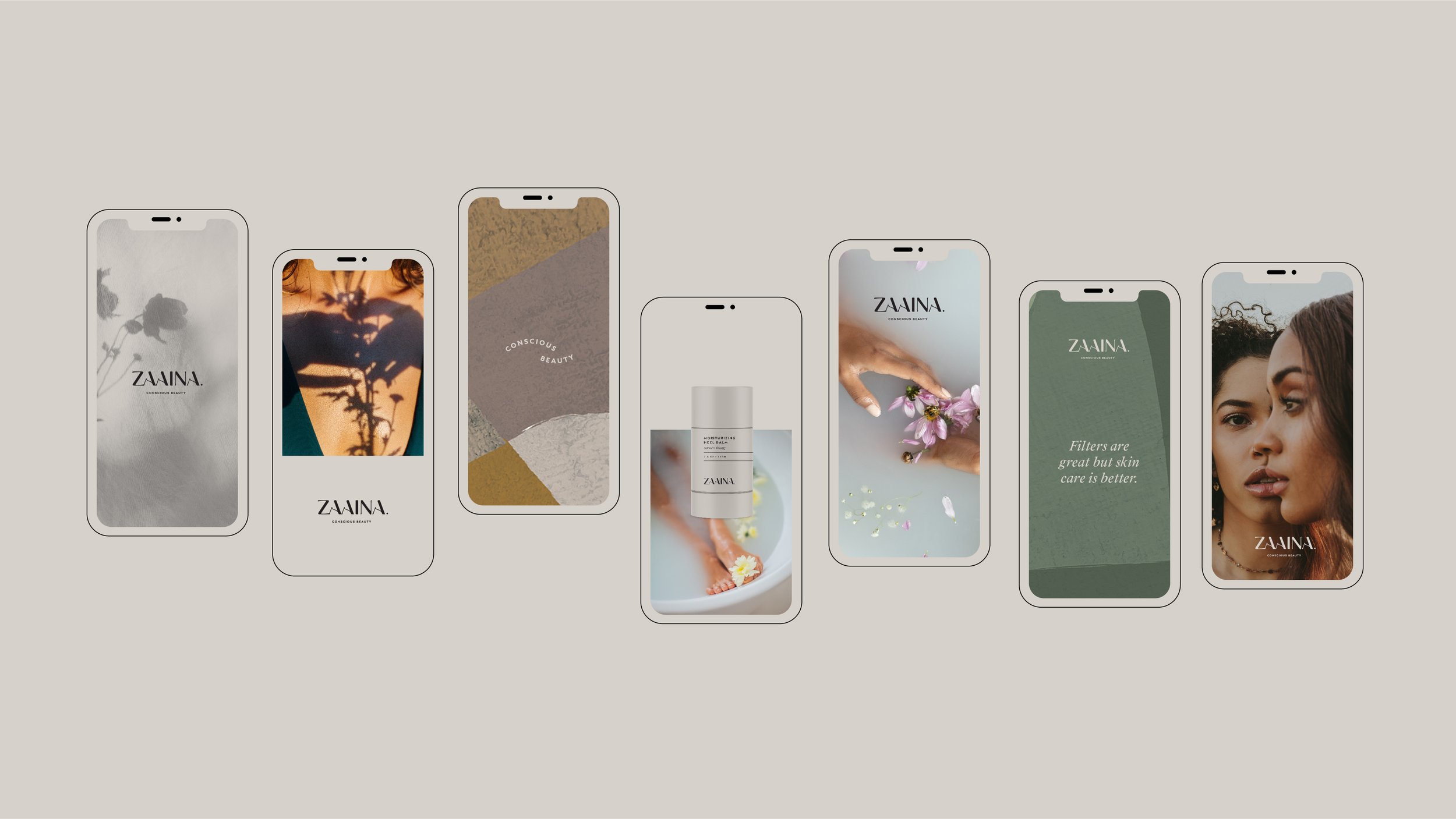
Designing for Retail & Scale
The packaging system was designed to perform across multiple environments:
eCommerce
boutique retail
large-scale distribution
Clarity and navigation were key:
colour supports product differentiation
typography ensures readability at pace
layout creates strong shelf presence
Sustainability also informed material choices, with eco-conscious packaging specified wherever possible.

Sophisticated branding and packaging that elevates the Zaaina brand to drive connection.
Global Collaboration
This project reflects our ability to work seamlessly with international clients.
Based in Australia, we collaborated closely with Zaaina’s US team — delivering a complete brand system across time zones, channels and markets.
Our process ensured:
clear communication and alignment
efficient decision-making
consistency across all outputs
This model continues to support clients across the US and beyond.


We had the absolute pleasure of working with “We Are Purpose” to rebrand our entire line of products. They are highly creative and have a strong understanding of design principles and can effectively communicate their creative vision.
The entire process was very methodical, to understand our brand vision, audience, and requirements to comprehend them in our brand bible. We Are Purpose understood our company’s values and mission and delivered the modern and minimalist look that we strived for. We were just quite amazed at how well they captured our thinking and brought the design to life on the first shot! We are Purpose has become part of our extended team and are looking forward to the partnership as we grow our brand. We highly recommend We Are Purpose for any design project and are confident that they will work tirelessly to bring your vision to life.
Purvi Desai - Creator and Director Zaaina


The Outcome
The rebrand positioned Zaaina for significant growth across both direct-to-consumer and retail channels.
The result:
a cohesive, scalable brand system
stronger shelf presence and product clarity
expanded retail distribution
increased brand recognition and consistency
Zaaina is now stocked across major platforms and retailers including Costco, Uncommon Goods and leading online marketplaces.
Why It Worked
Clarity and restraint.
By simplifying the visual language and strengthening the strategic foundation, the brand now communicates instantly — while still carrying depth, story and authenticity.
It’s a system designed not just for launch, but for long-term growth.
Ready to move your brand forward?
Book a 30-minute discovery call and we’ll explore where you are now, where you want to go, and what it will take to get there.