Project Description
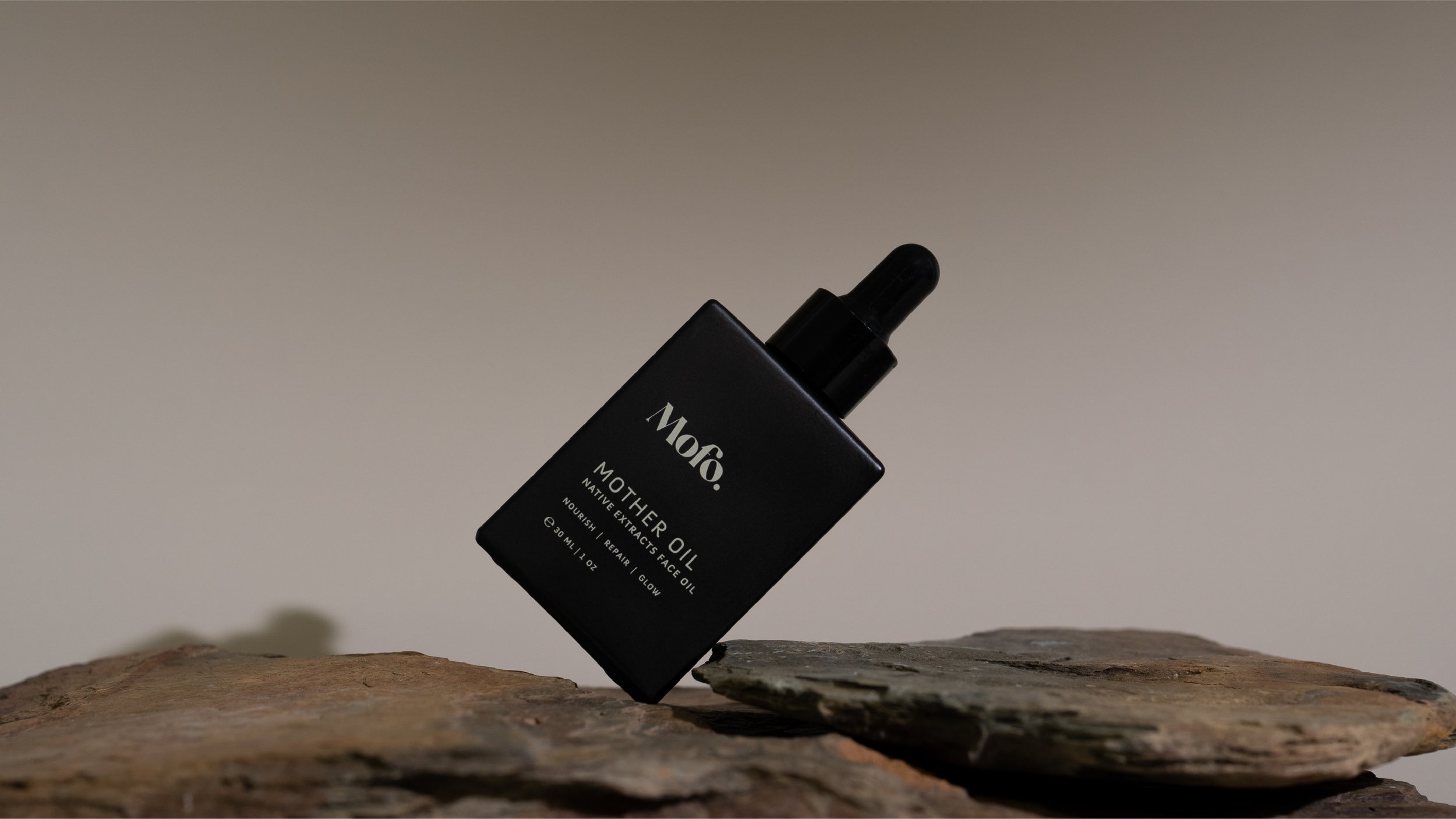
MOFO — Skincare Branding & Packaging Design
A bold, modern skincare brand grounded in Australian botanicals — designed to feel effortless, ethical and quietly confident.
We partnered with MOFO to create a distinctive brand identity and packaging system that could stand apart in a saturated clean beauty market, while remaining true to its philosophy: simple, effective skincare without compromise.
Services Provided
— Brand Strategy
— Identity Design
— Brand Creative
— Icon Design
— Illustration
— Packaging Design
— Photography
— Website
Project Links
The Opportunity
MOFO was founded by BAFTA award-winning makeup artist Nikki Gooley, bringing decades of experience working with skin under pressure — from film sets to real life.
The vision was clear: create a skincare range that was clean, high-performing and uncomplicated. But the brand needed to translate this into a visual identity that could compete in both professional and consumer markets — balancing credibility, desirability and clarity.
The challenge was to move beyond typical “natural skincare” cues and create a brand that felt modern, confident and culturally relevant.


The MOFO brand is strong and fresh, smart and ethical. A touch tomboy with a feminine heart…


Brand Strategy & Positioning
Our approach focused on positioning MOFO as a next-generation clean beauty brand — one that blends professional performance with ethical formulation.
Rather than leaning into overly soft or clinical aesthetics, the brand was shaped around a distinct personality:
strong but understated
ethical but not preachy
minimal but expressive
a touch tomboy with a feminine edge
This positioning allowed MOFO to sit confidently between luxury skincare and conscious wellness, appealing to both industry professionals and design-aware consumers.


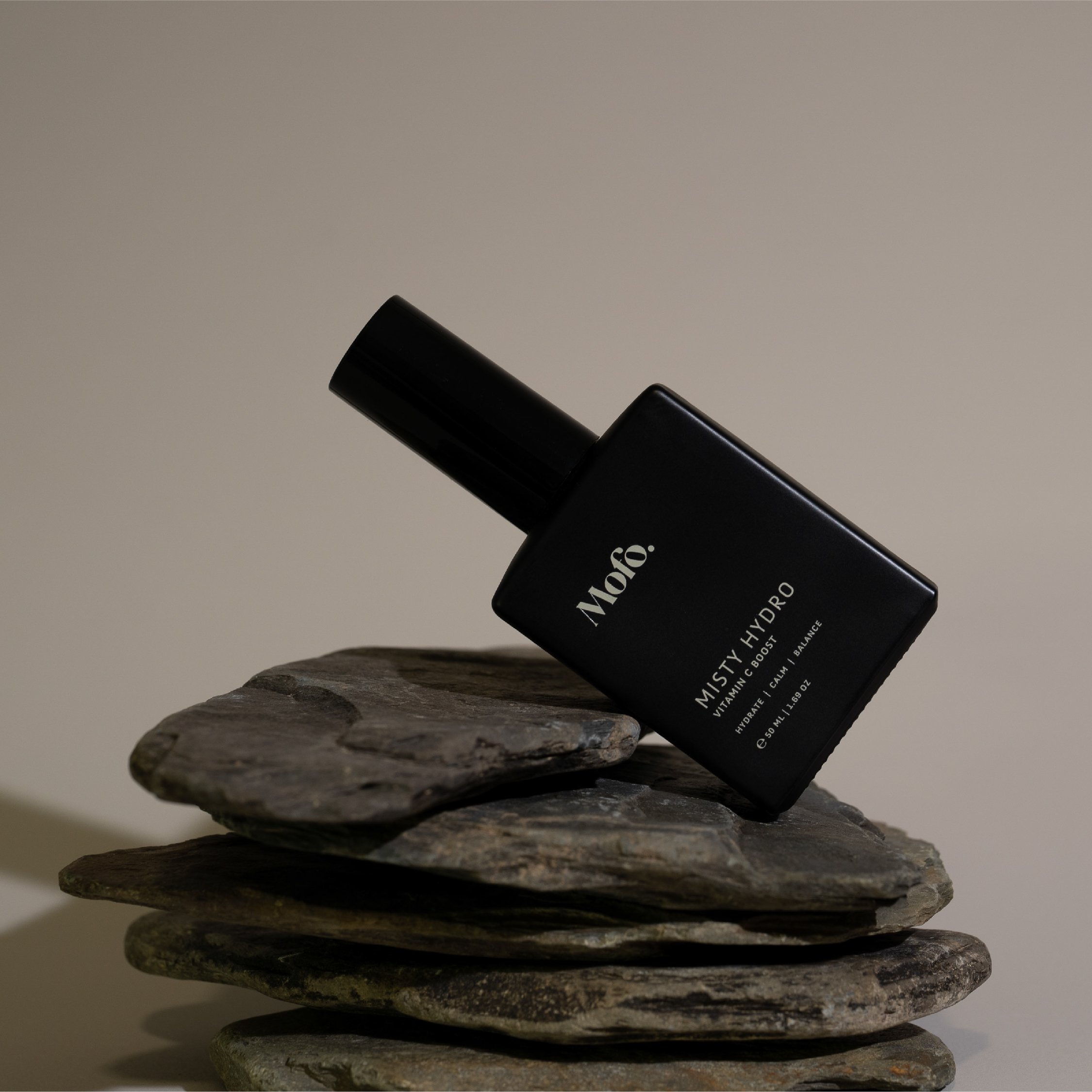
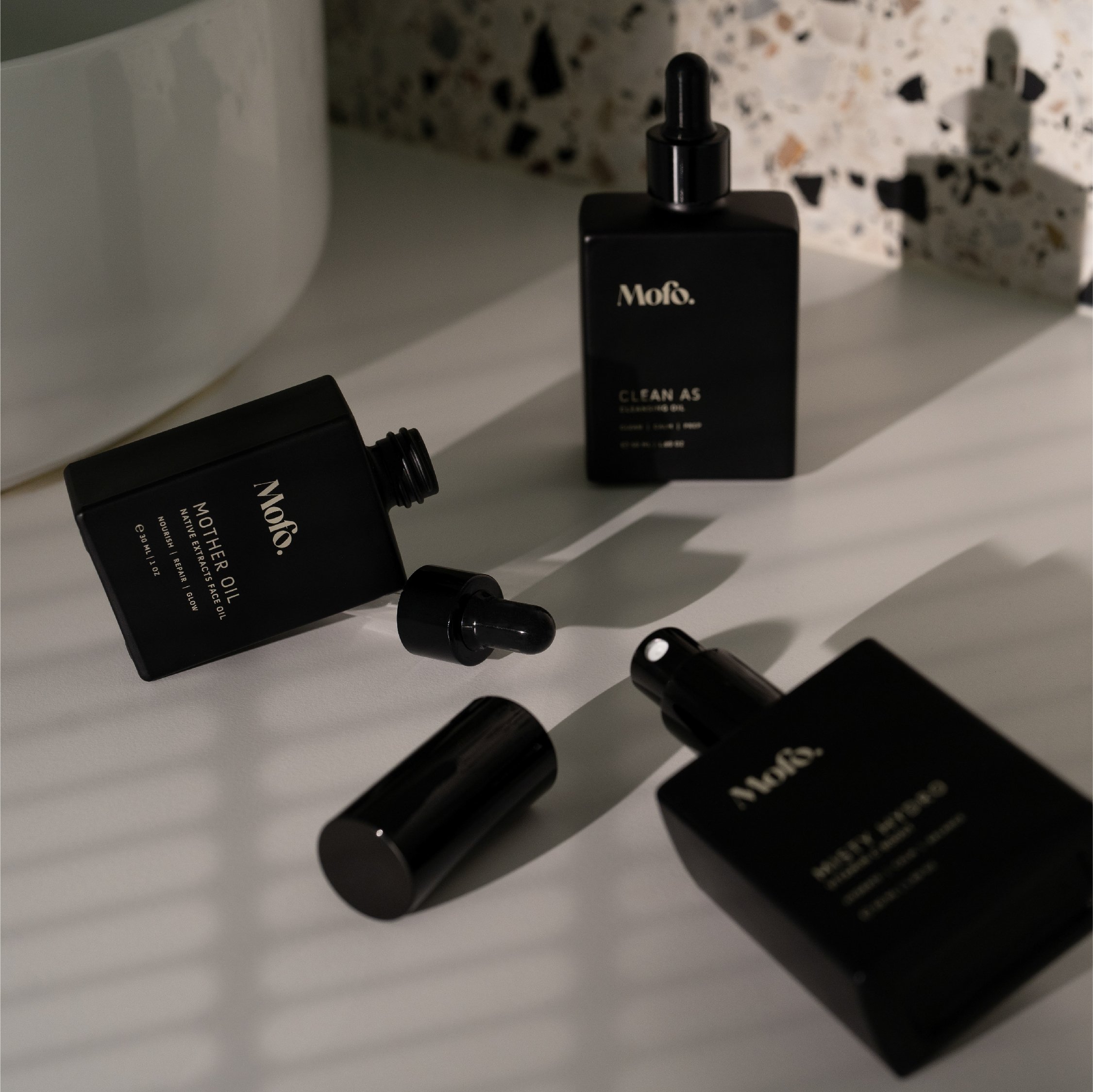
Visual Identity & Packaging System
The identity was designed to feel effortless, modern and enduring.
A restrained typographic approach and minimal visual language created space for the product to speak, while subtle design decisions introduced character and edge. The result is a brand that feels refined without being overworked.
The packaging system was developed with both function and shelf impact in mind:
clear hierarchy and readability
confident, minimal layouts
tactile, considered materiality
alignment with sustainable and low-impact principles
The system supports MOFO’s multi-functional product range while maintaining a cohesive and recognisable presence across every touchpoint.


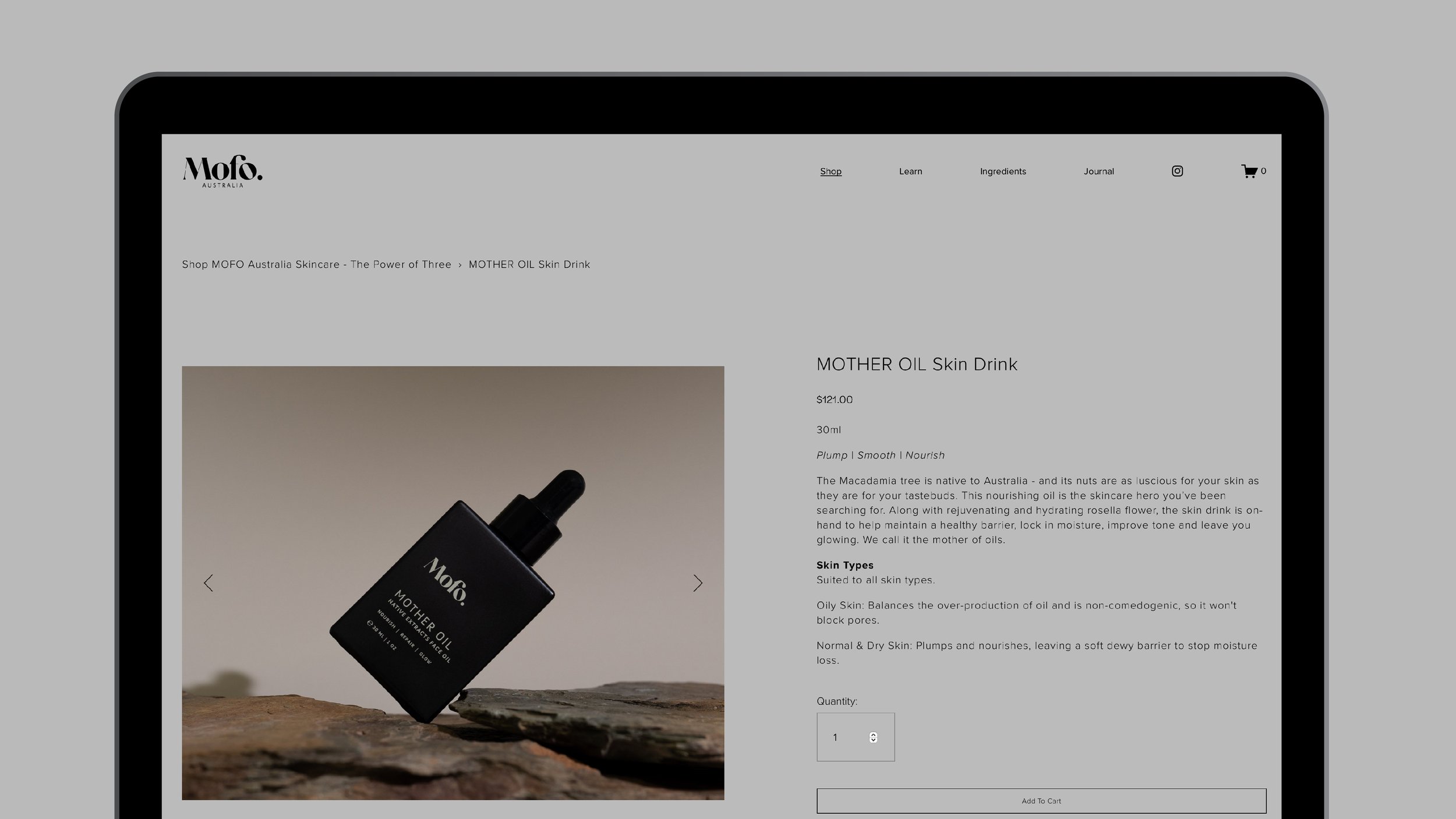

Digital Experience
The eCommerce experience extends the same philosophy — simple, calm and intuitive.
The website was designed to:
prioritise clarity of product information
reduce friction in the buying journey
reinforce the brand’s tone of voice and visual restraint
The result is a digital environment that reflects MOFO’s core belief: skincare doesn’t need to be complicated.
Craft, Sustainability & Ingredient Integrity
At the heart of MOFO is a commitment to true-to-nature formulation and low-impact production.
The brand avoids petrochemicals, synthetic additives and unnecessary processing, instead focusing on:
Australian botanicals
sustainably sourced ingredients
small-batch production
simplified routines
The design system supports this philosophy — ensuring the brand communicates integrity without relying on clichés.


Recognition
The MOFO packaging design was named a Finalist in the 2024 AGDA Design Awards, recognising its balance of modern luxury, sustainability and clarity.
This acknowledgement reflects the strength of the design system — not just as an aesthetic outcome, but as a commercially viable and strategically grounded brand.
The Outcome
MOFO now stands as a confident, contemporary skincare brand — one that resonates across both professional and consumer audiences.
The brand system provides:
a clear and scalable foundation for growth
strong shelf presence in a competitive category
alignment between product, philosophy and presentation
credibility within both clean beauty and professional makeup communities
This project demonstrates how thoughtful brand strategy and packaging design can transform a product into a distinct, desirable and future-ready brand.


Ready to move your brand forward?
Book a 30-minute discovery call and we’ll explore where you are now, where you want to go, and what it will take to get there.
Related Work | Explore more projects.