
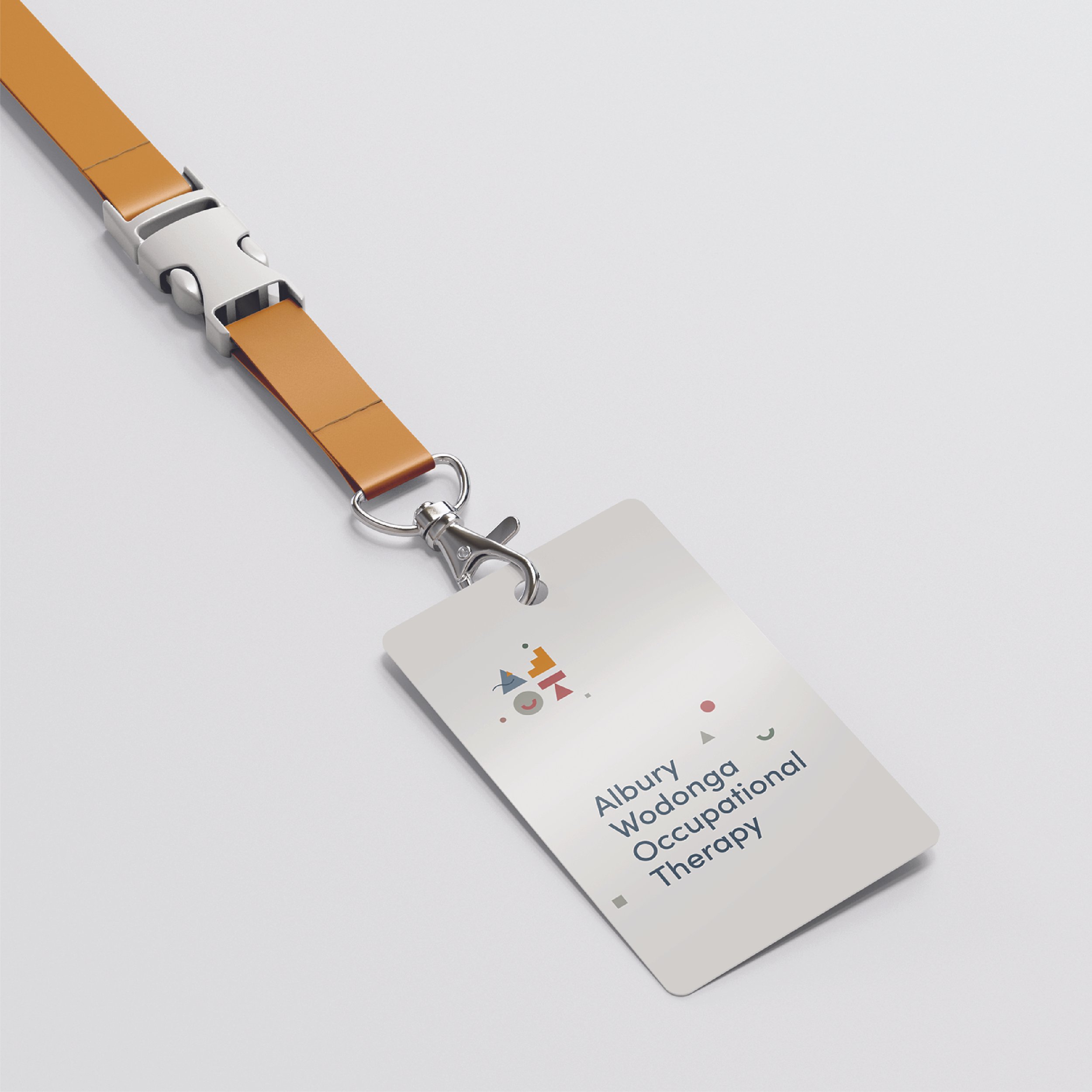
Albury Wodonga Occupational Therapy
Project Description
AWOT — Allied Health & Occupational Therapy Branding
A thoughtful, human-centred brand for a practice supporting children, families and growth.
We partnered with Albury Wodonga Occupational Therapy (AWOT) to create a brand identity and digital experience that balances clinical credibility with warmth, care and connection — designed for families navigating deeply personal journeys.
Services Provided
— Brand Strategy
— Visual Identity
— Supporting Secondary Identities
— Brand Design and Brand Bible
— Copywriting
— Website Design

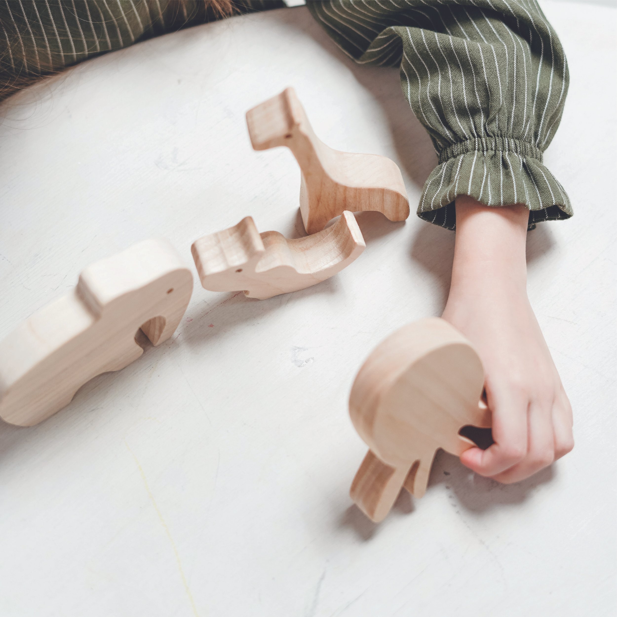
AWOT is an occupational therapy practice supporting children and young people through critical stages of development.
The Opportunity
AWOT is an occupational therapy practice supporting children and young people through critical stages of development.
At the heart of the business is a relational model of care — one that prioritises connection between therapists, families and the children they support.
The challenge was to create a brand that could:
feel professional and clinically trustworthy
remain warm, approachable and human
support families during often emotional and vulnerable experiences
This is a delicate balance — one many healthcare brands struggle to achieve.
“From the moment I connected with We Are Purpose I absolutely knew I was in the right place... They just got me and my brief straight away...it was like they were inside my head. They asked all the right questions to really get me thinking about my business and the result was stunning. Starting a new business is daunting but having this strong and unique branding gives me the confidence to stand behind it proudly. I wouldn’t hesitate to work with them again.”
— Susie Bush, Owner AWOT
A Purpose-Led Approach
AWOT first connected with us through our positioning around purpose-led design — a shared belief that branding in health and community contexts must go beyond aesthetics.
For us, this project was also deeply aligned with our own lived experience — understanding the importance of clarity, reassurance and trust for families navigating the disability sector.
Our strategic work focused on clarifying AWOT’s role as:
a trusted guide for families
a supportive, nurturing environment
a professional service grounded in empathy and care
Brand Strategy & Positioning
We positioned AWOT as a practice that bridges two essential qualities: clinical expertise and human connection.
The brand needed to communicate:
professionalism without feeling clinical or cold
warmth without losing credibility
individuality while remaining clear and accessible
This foundation informed every aspect of the identity and communication system.


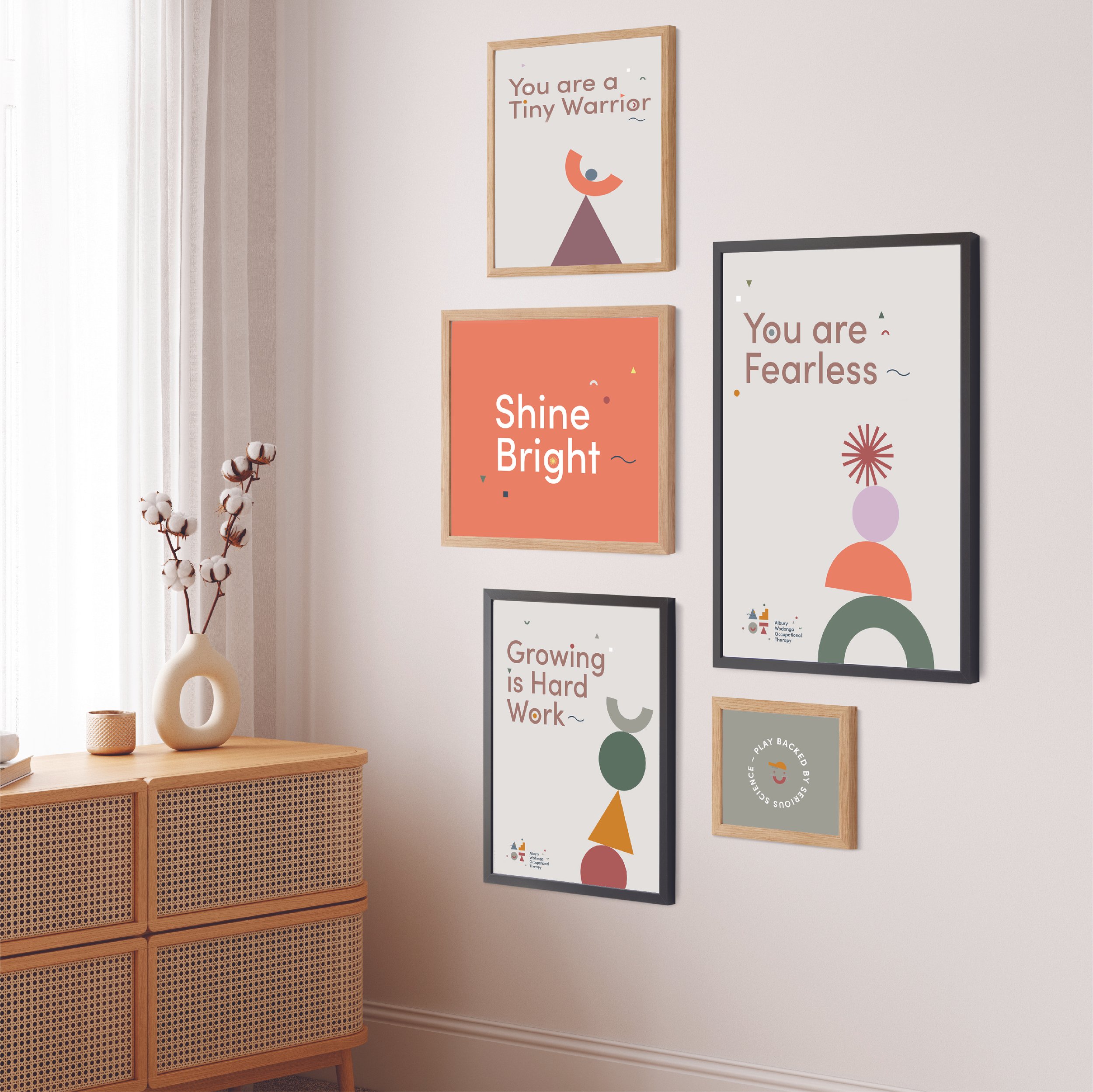

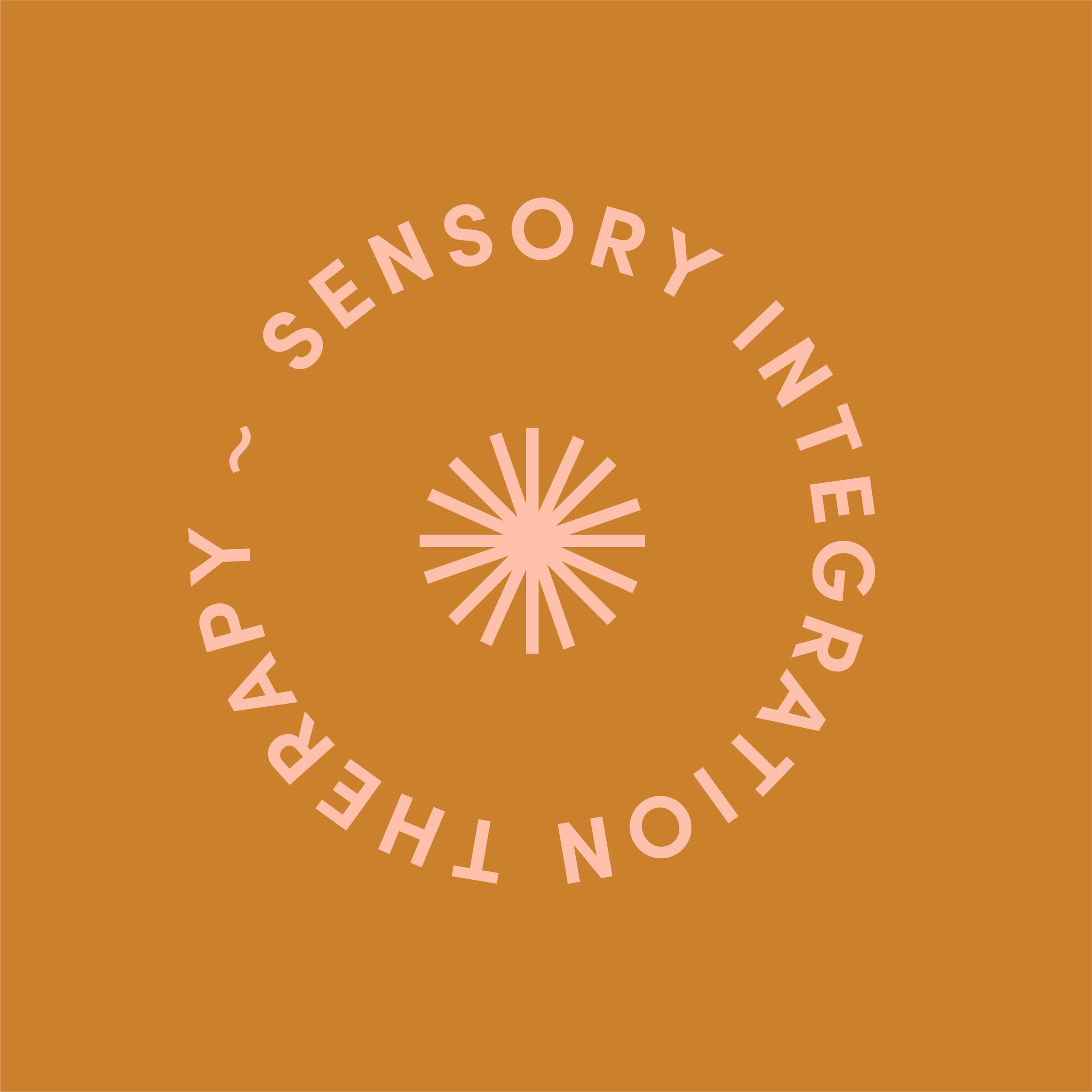
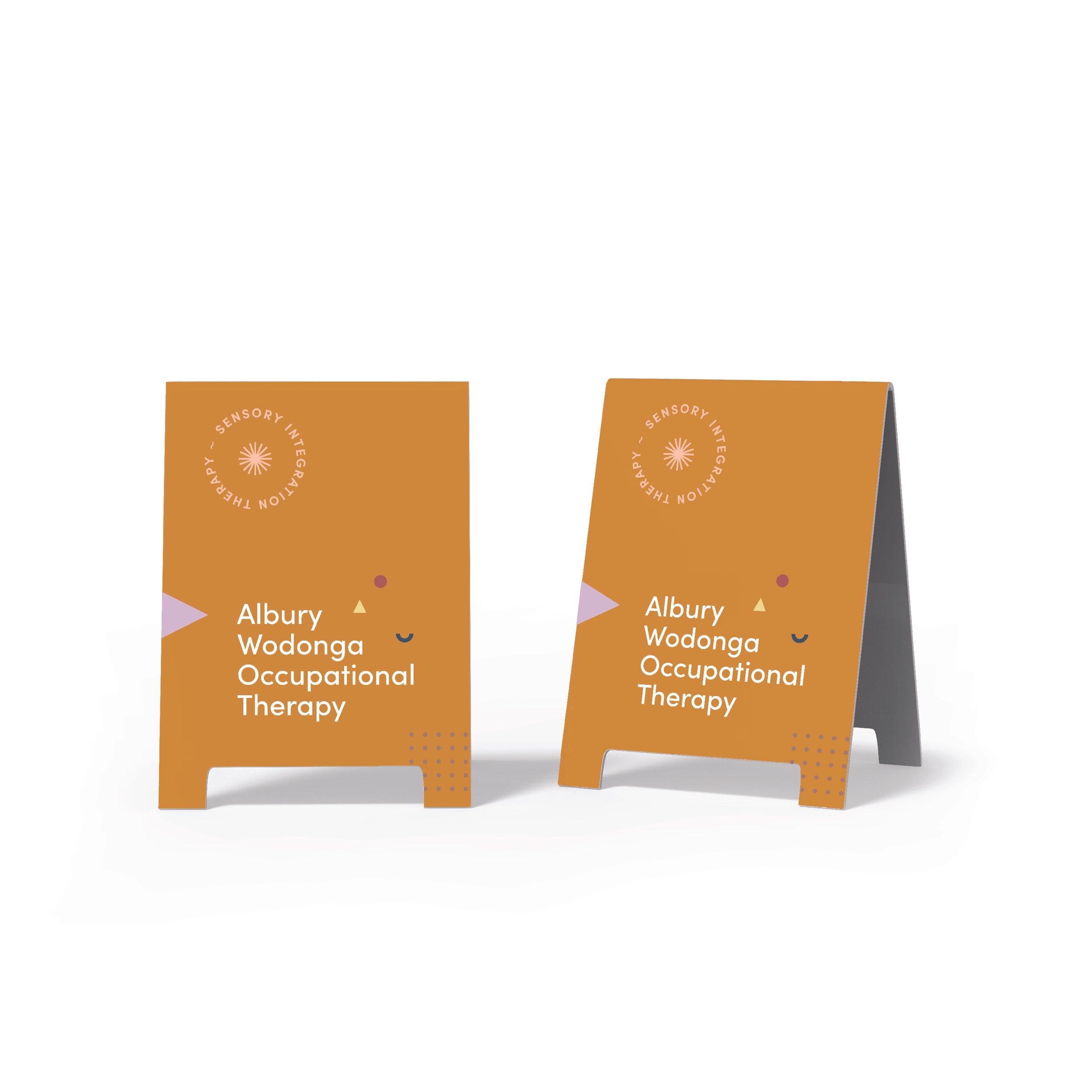
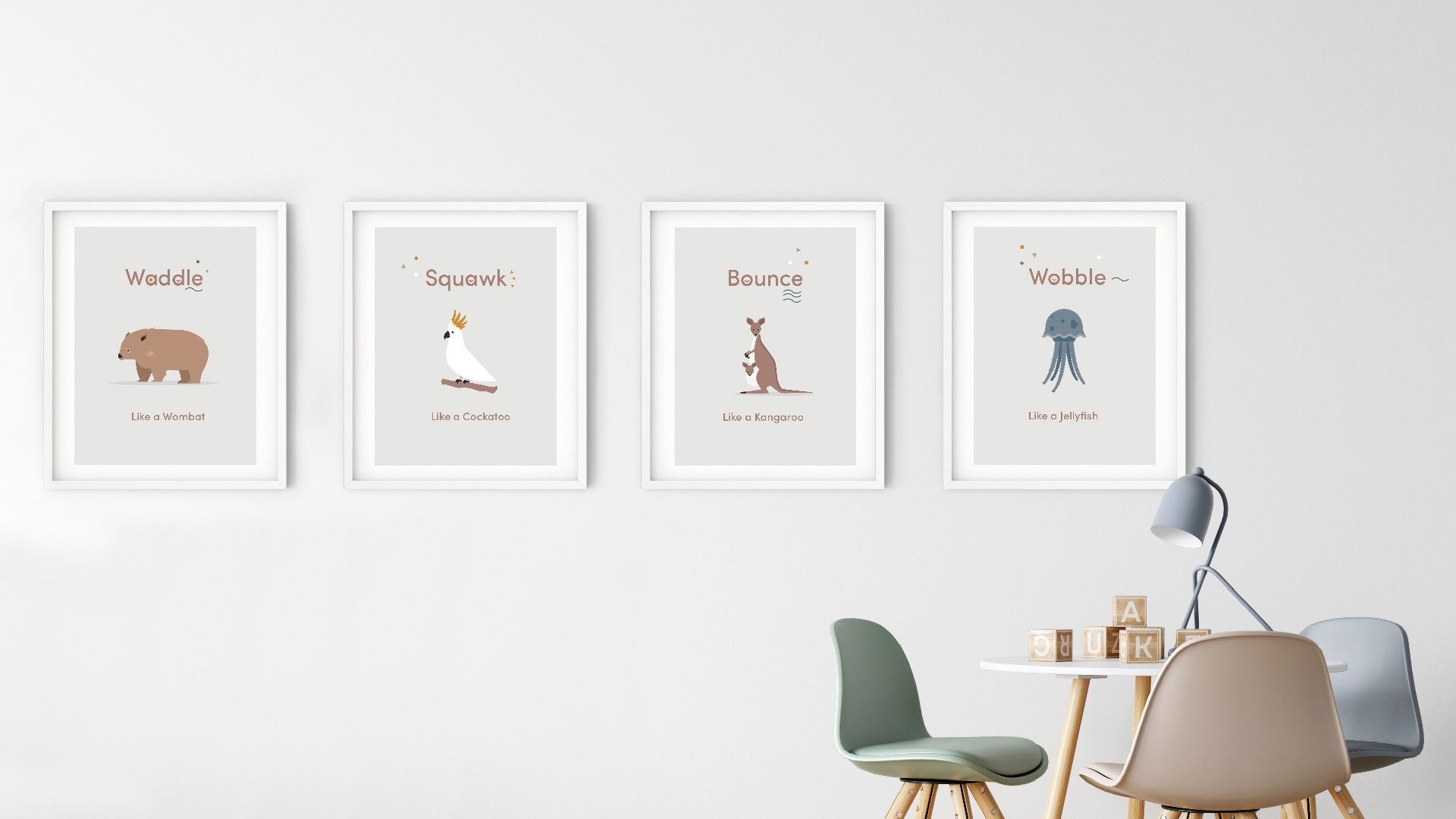
Visual Identity & Brand System
The identity was designed to feel calm, grounded and deeply human.
We developed:
custom letterforms inspired by therapeutic tools and environments
an earthy, approachable colour palette
a visual language that balances softness with clarity
The result is a brand that feels:
reassuring and welcoming
considered and professional
authentic rather than over-designed
The handcrafted typography introduces a human quality, while the structured system ensures consistency across all touchpoints.
Tone of Voice & Digital Experience
Beyond visual identity, we shaped how AWOT communicates.
Copywriting and tone of voice were developed to:
reduce overwhelm for families
provide clarity around services
create a sense of reassurance and support
The website experience was designed to feel:
intuitive and easy to navigate
calm and considered
aligned with the emotional needs of its audience
Every interaction is designed to build confidence — from first visit through to ongoing engagement.


Designing for the Disability & NDIS Sector
Branding within the disability and allied health sector requires a different approach.
It demands:
accessibility and clarity
emotional sensitivity
trust-building from the first interaction
alignment between service, language and experience
This project reflects our belief that in this space, brands must be felt as much as they are seen — supporting connection, confidence and dignity.
The Outcome
AWOT now has a brand that reflects the depth of its care and the quality of its service.
The outcome is:
a clear and confident foundation for growth
a brand that resonates with both families and professionals
a digital experience that supports ease, clarity and trust
a visual and verbal system that can scale over time

Ready to move your brand forward?
Book a 30-minute discovery call and we’ll explore where you are now, where you want to go, and what it will take to get there.