Project Description
Kyn Folk — Brand Strategy, Identity & Packaging Design
The Opportunity
Kyn Folk was born from a love of travel and a deep appreciation for local food, culture and community along Victoria’s Great Ocean Road. Formerly operating as Surf Coast Picnic Co, the business had outgrown its original name and identity.
While the offering was thoughtful and well-crafted, the brand no longer reflected the quality of the product, the values of the founders, or where the business was heading. There was a growing disconnect between what the business was becoming and how it was being experienced.
The opportunity was to reposition the brand — to create something more aligned, more confident, and capable of supporting its next phase of growth.
Services Provided
– Brand positioning & naming
– Visual identity system
– Brand strategy & narrative development
– Packaging system design
– Digital experience design (UI)
– E-commerce implementation
Location
Torquay, Australia
Project Links
Repositioning the Brand
Our work began with a strategic reset. This wasn’t about changing how things looked — it was about redefining what the brand stood for.
Through discovery and brand strategy, we reframed the business as a curator of meaningful, locally sourced experiences rather than a provider of picnic hampers alone. This shift opened up a more expansive and enduring direction for the brand.
It gave the business clarity — not just in how it communicates, but in how it grows.
Naming & Brand Strategy
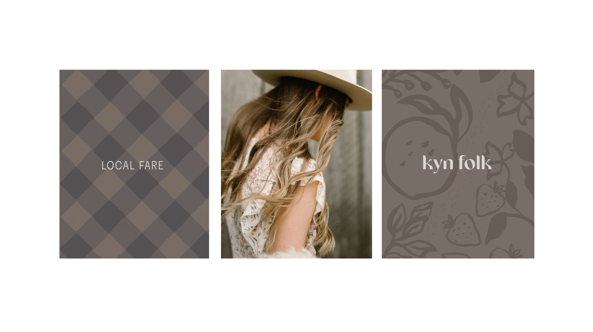
This thinking led to a complete rename: Kyn Folk.
A name grounded in meaning — “Kyn” representing family and the community of local makers, and “Folk” reflecting the people these experiences are created for and shared with.
It’s simple, warm and human — capturing the essence of the brand without over-explaining it.
From a strategic perspective, the name creates space. It moves the brand beyond a purely regional or tourism-led offering and into something more flexible, more ownable, and more capable of evolving over time.
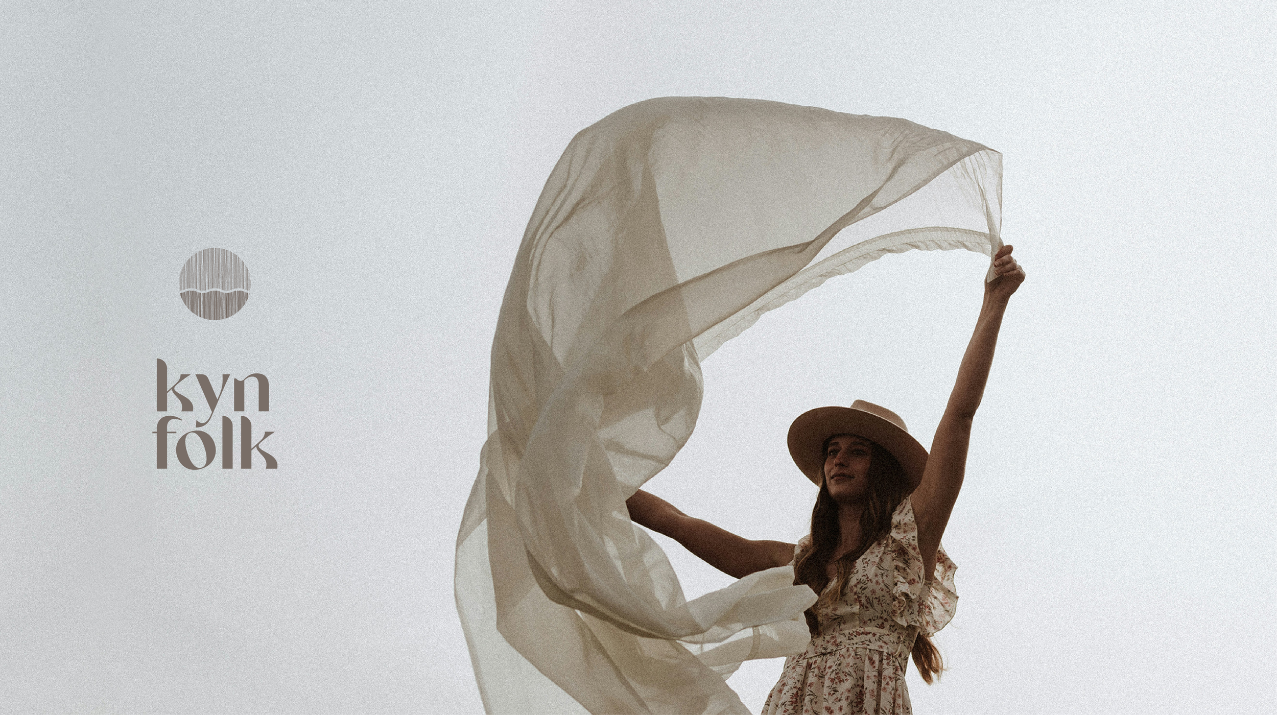
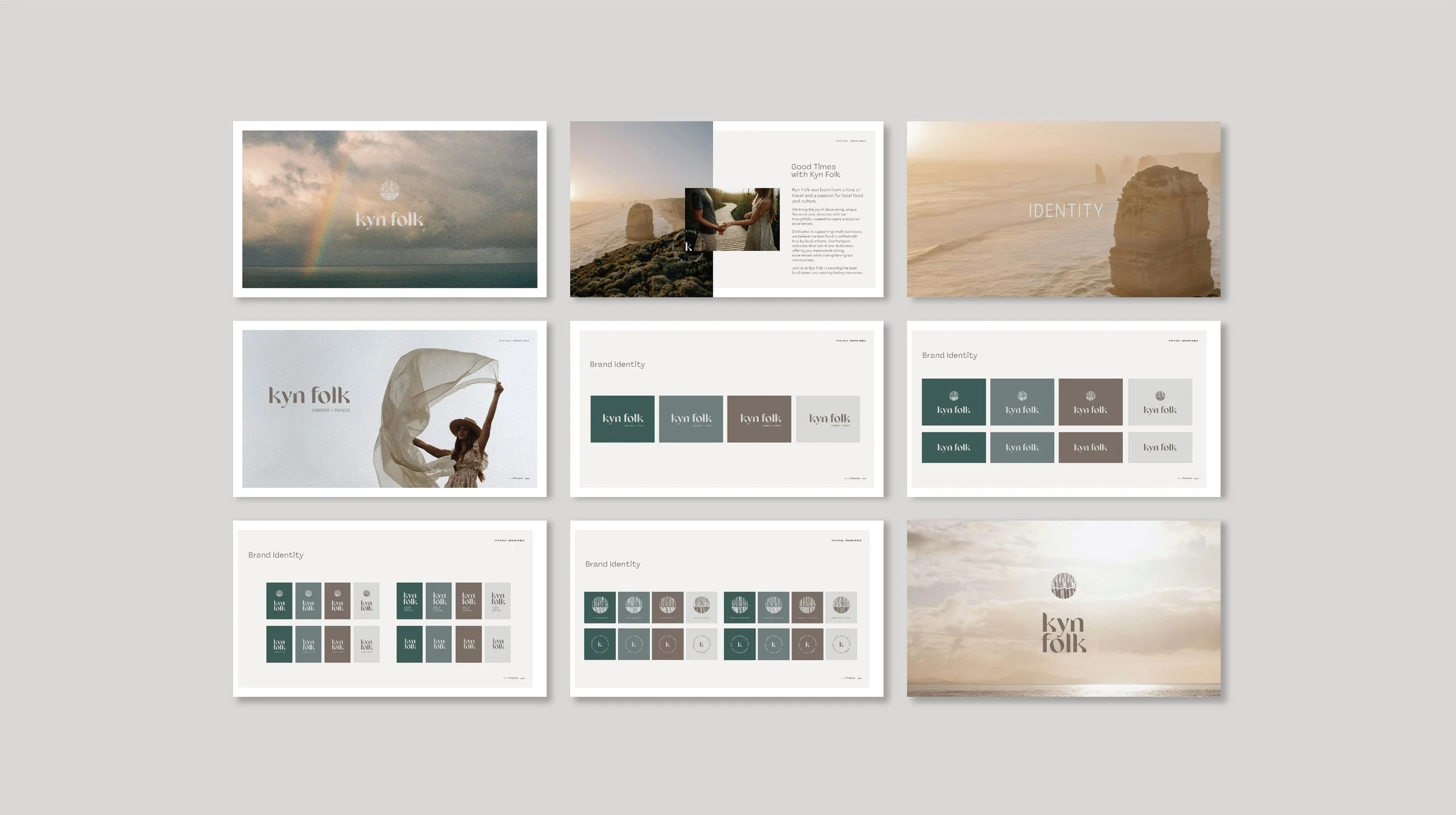
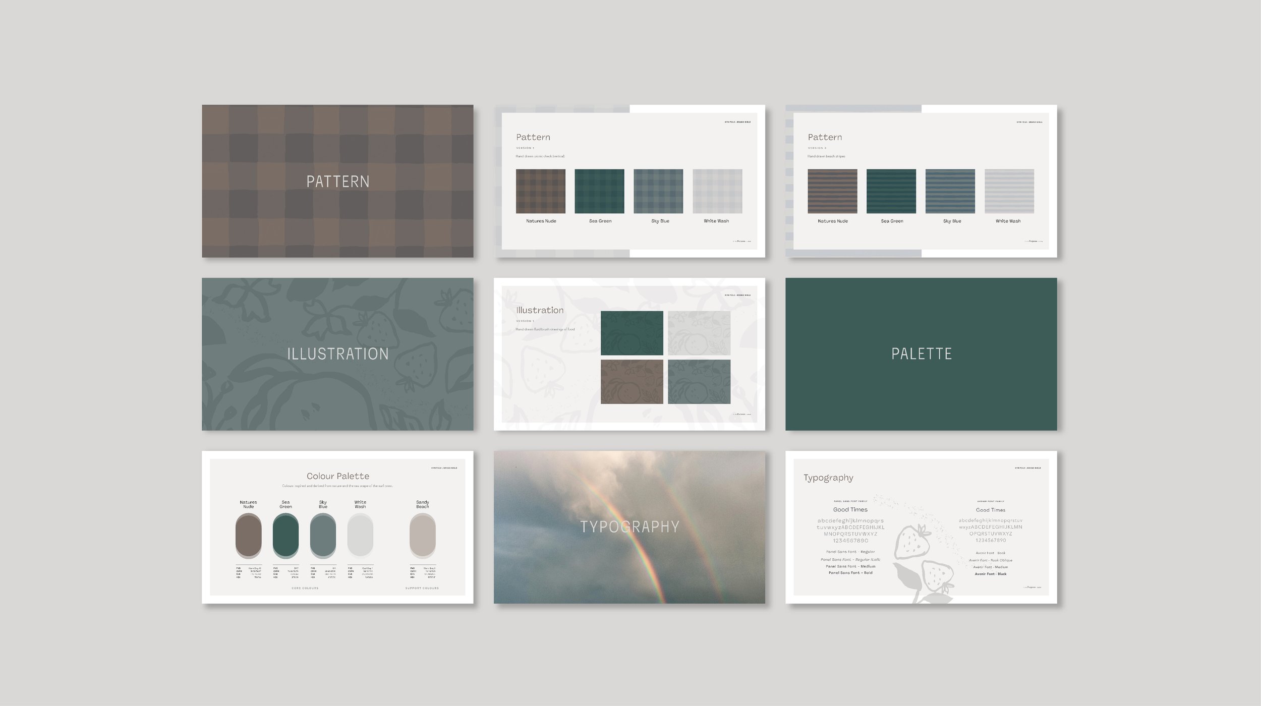
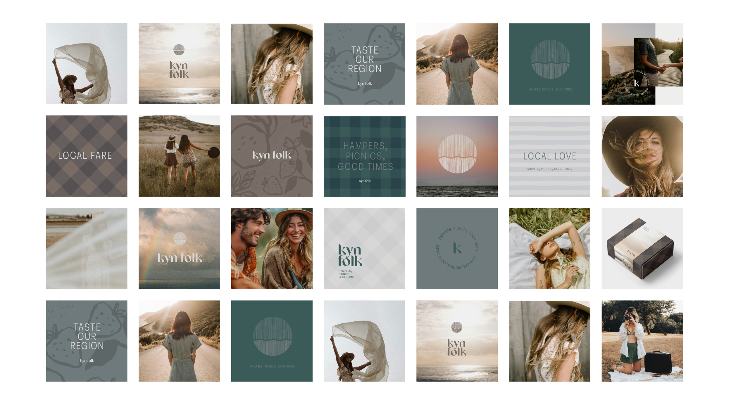
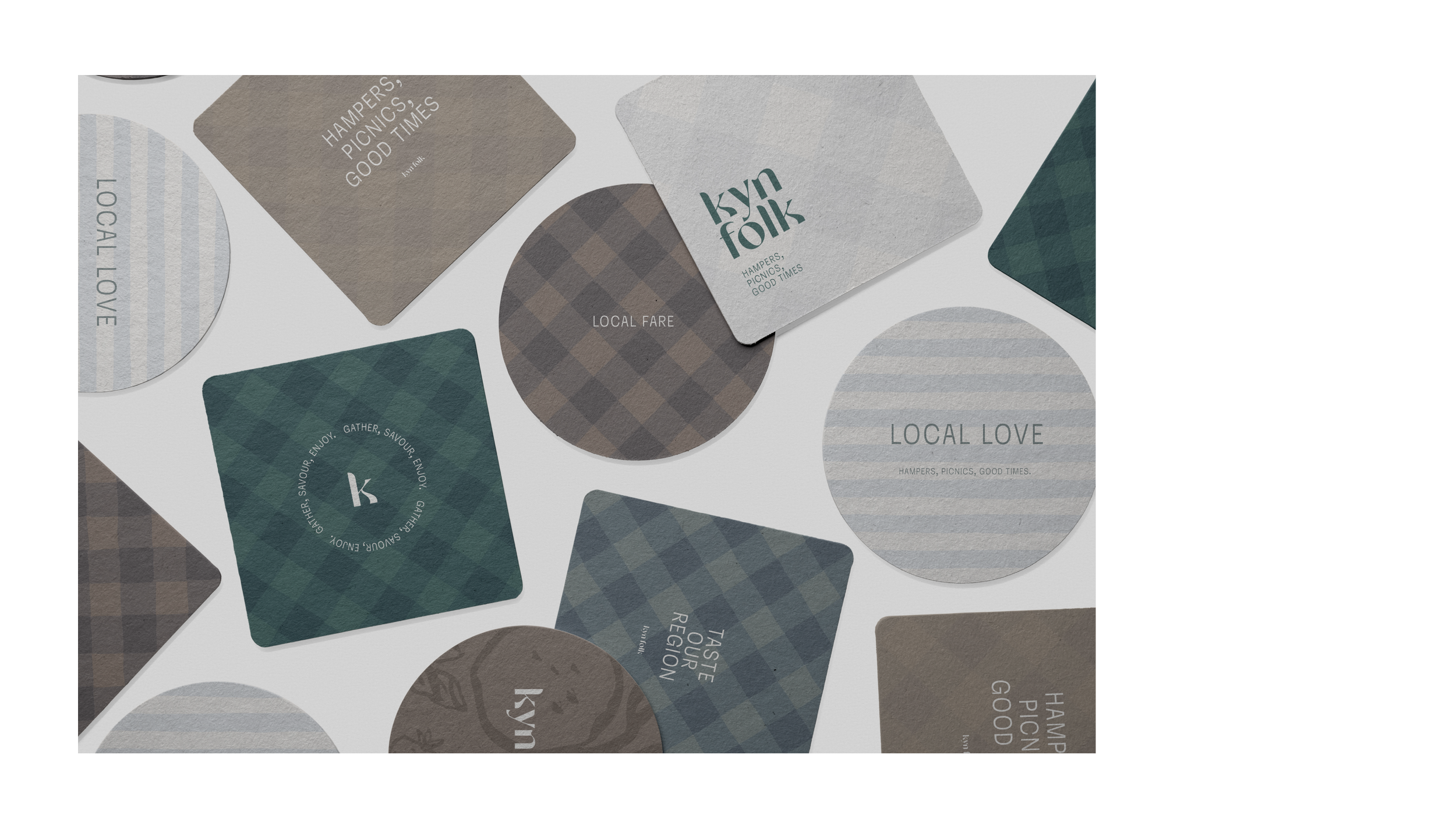
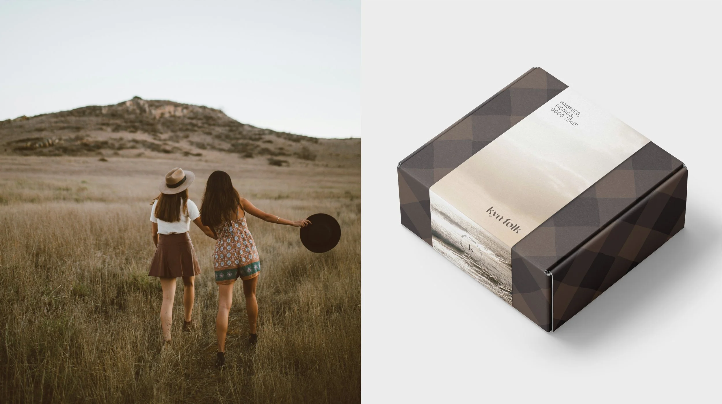
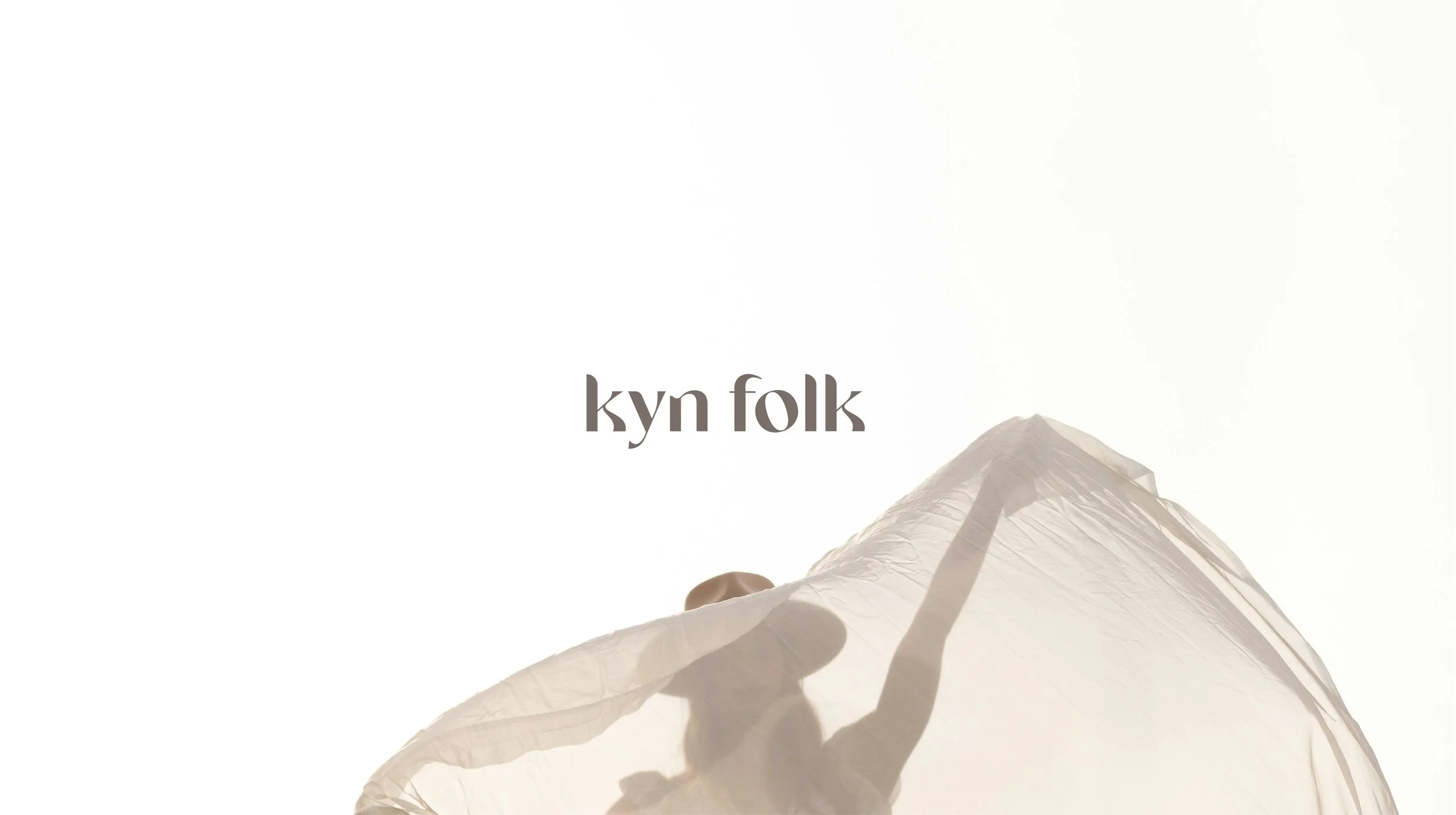
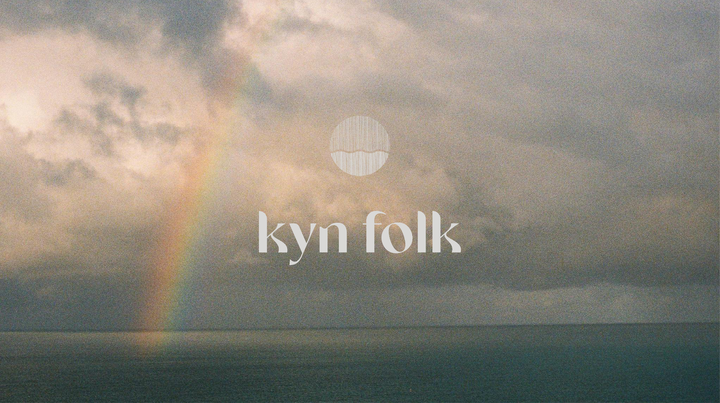
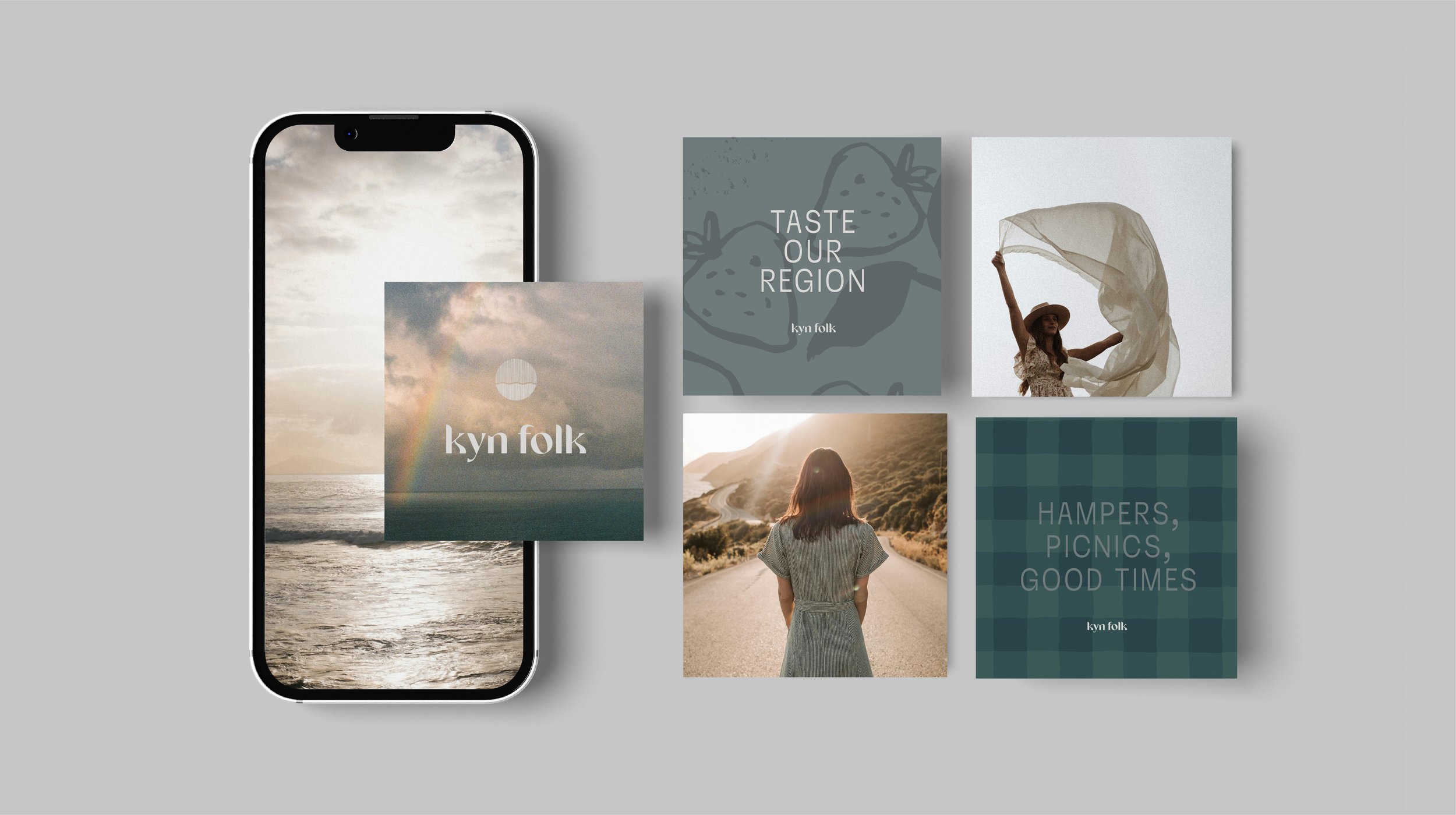
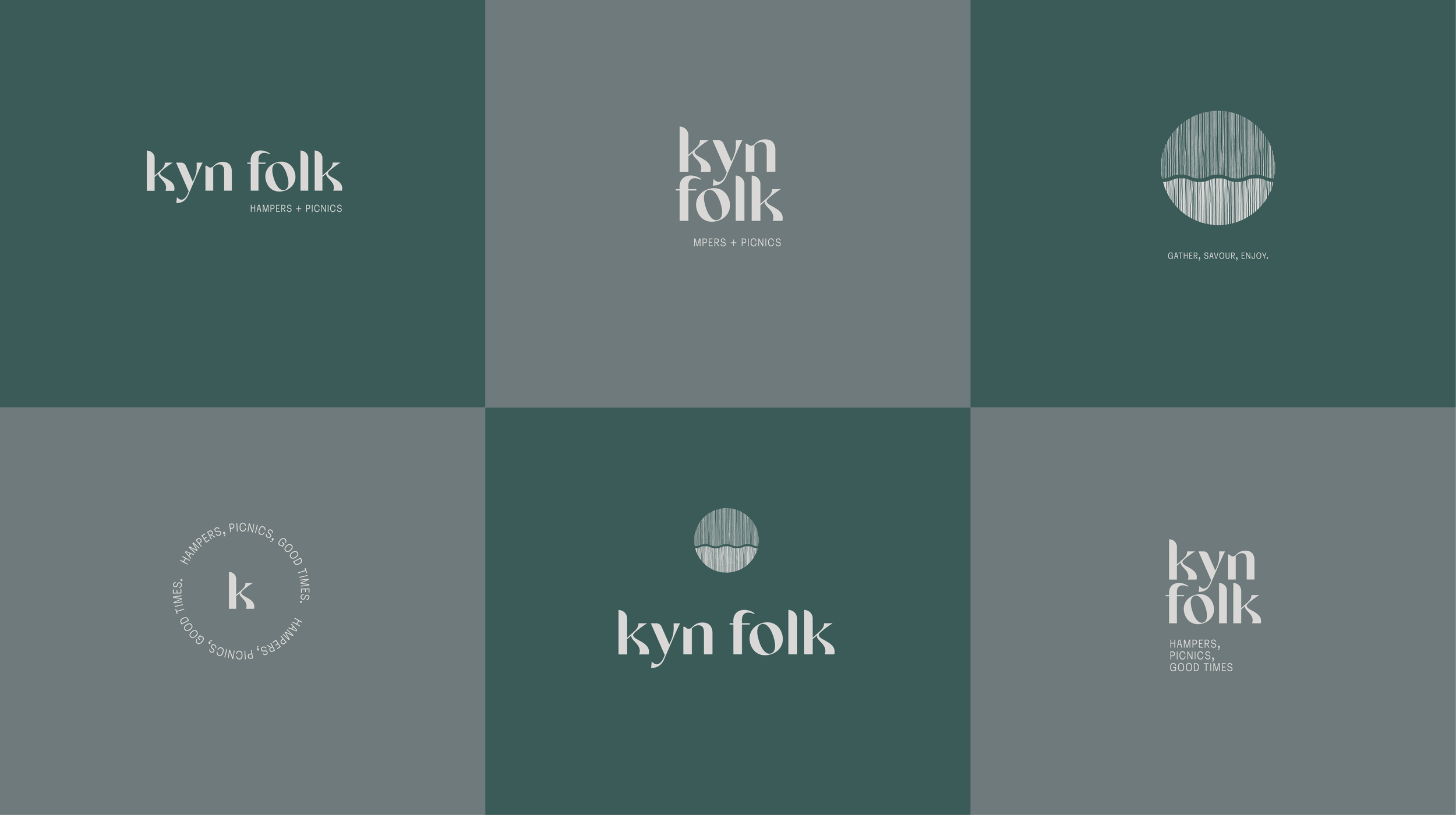
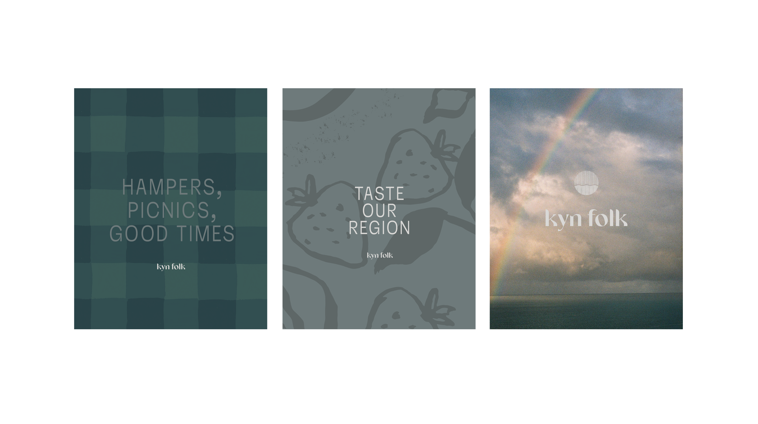
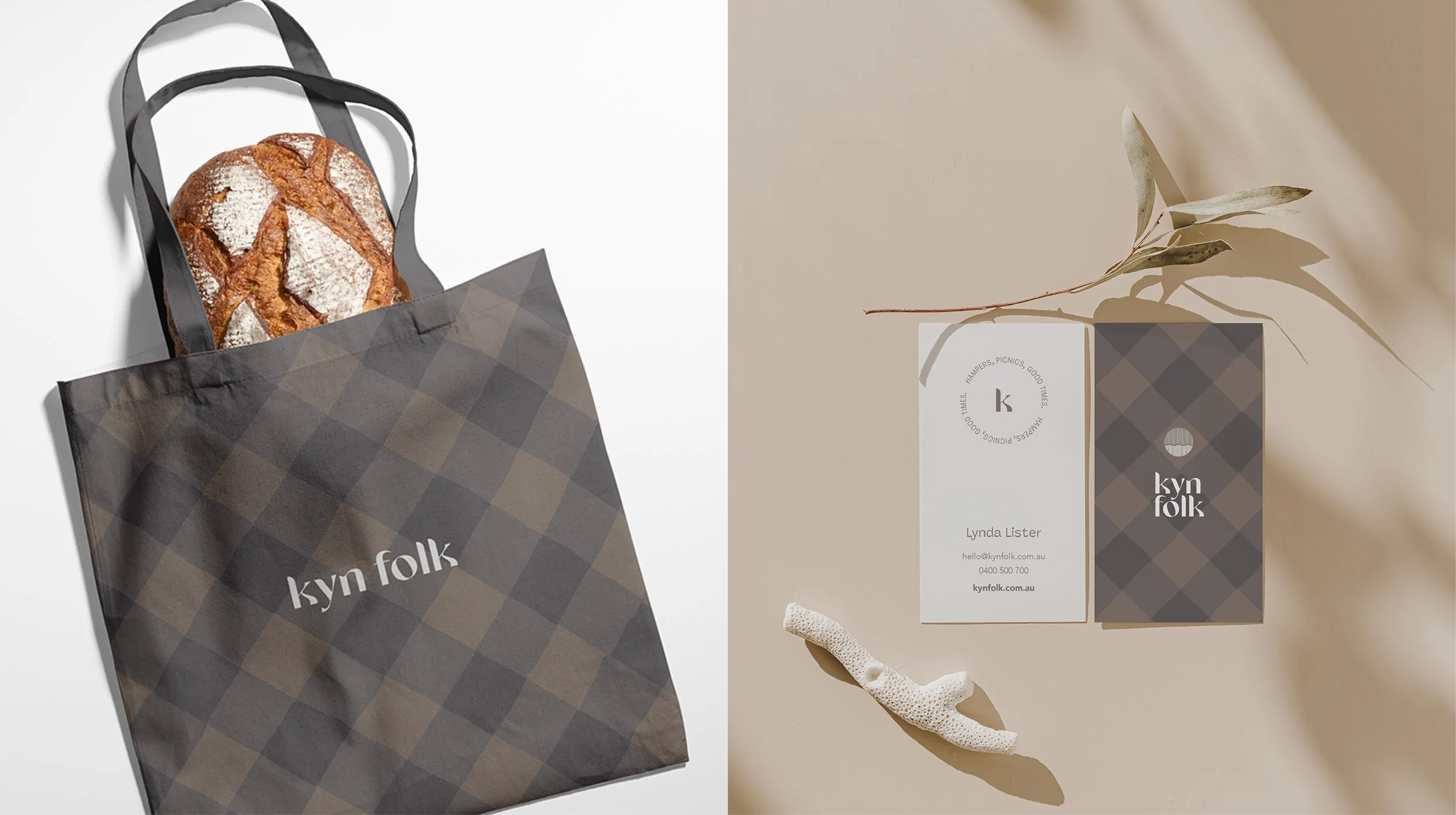
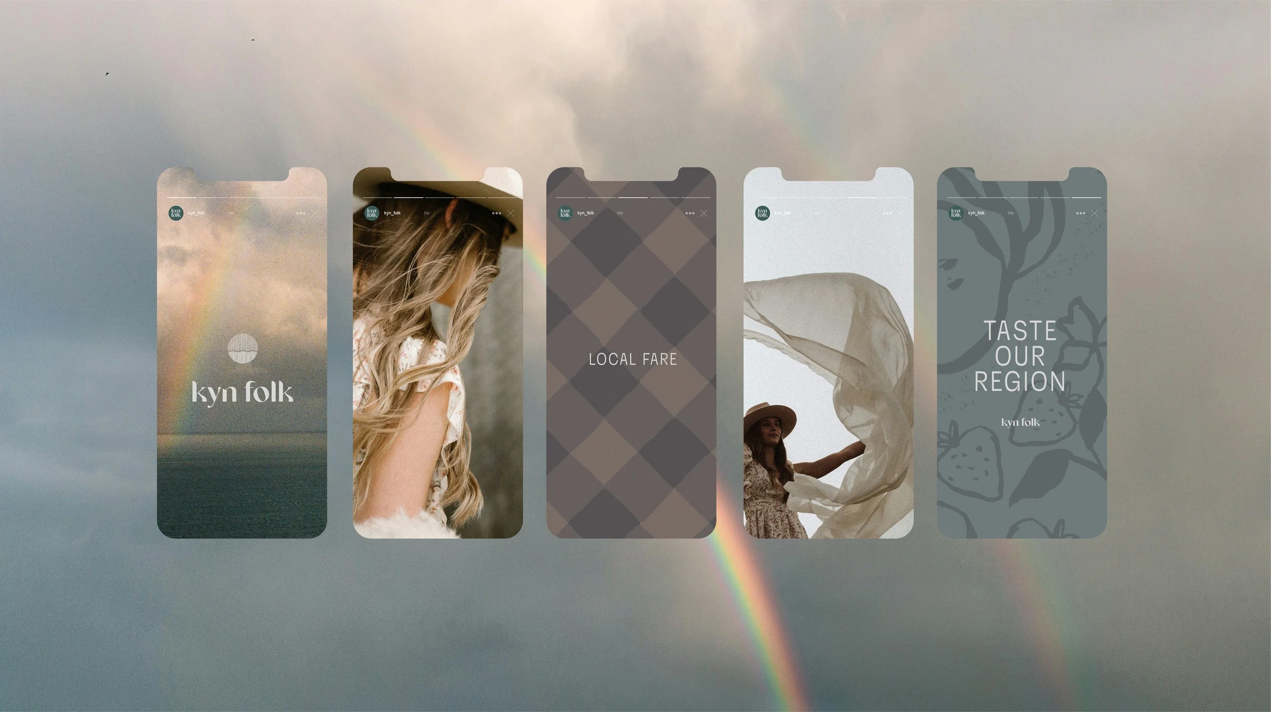
Visual Identity & Packaging System
The identity was designed to feel refined yet grounded — balancing the warmth of handmade, small-batch producers with a level of polish that would feel at home in more elevated or corporate settings.
The visual language draws on the rhythms of the Surf Coast and Great Ocean Road — subtle references to landscape, travel and the coming together of many makers into one considered experience.
Typography, tone and composition were carefully shaped to feel calm, confident and human. The packaging system extends this — creating a cohesive, tactile experience that reinforces the care behind each product.
Every element works together to elevate perception while staying true to the brand’s roots.

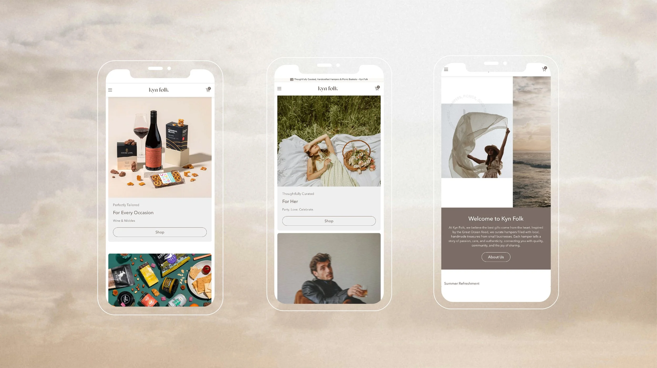
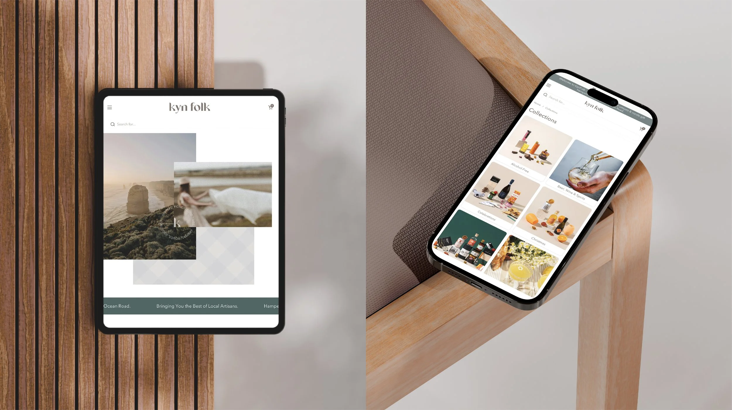
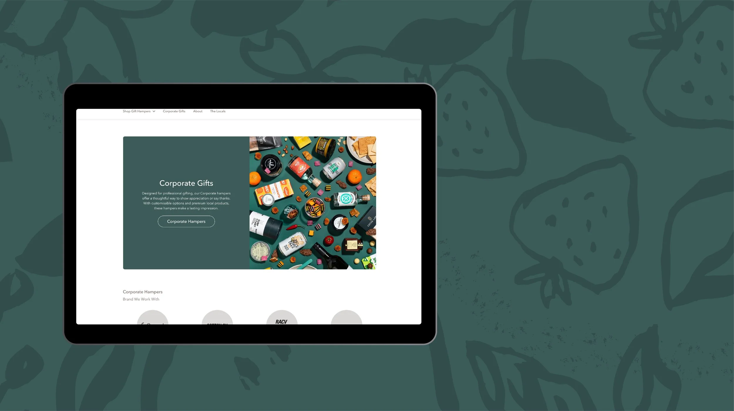
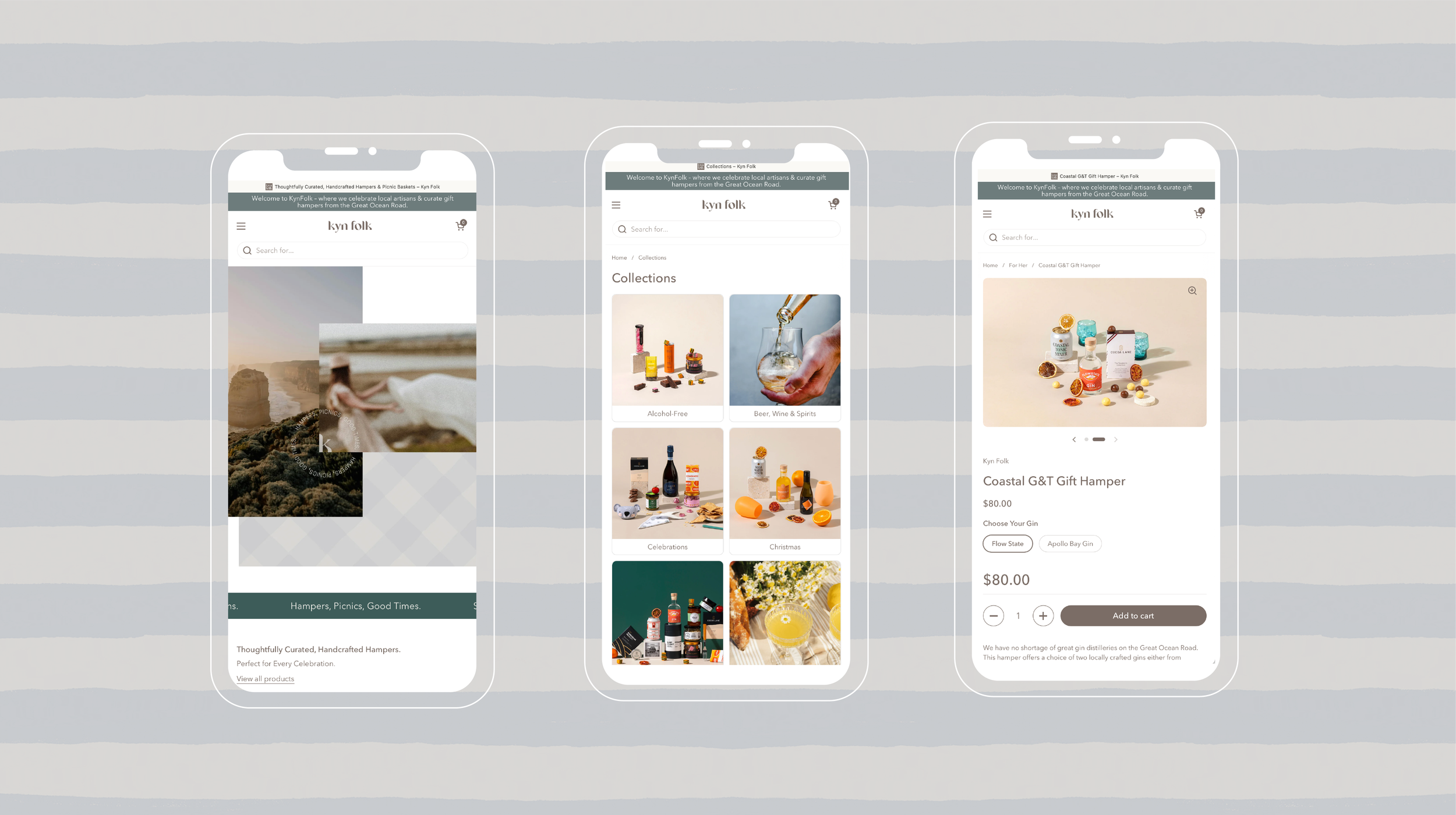
Digital Experience
The brand was carried through into a simple, considered digital experience. The focus was clarity — allowing the story, the makers and the product to speak without friction. Navigation, structure and content were designed to feel intuitive, supporting both browsing and purchase without overcomplication.
Importantly, the digital experience reinforces the brand’s positioning — not just what Kyn Folk offers, but why it exists.

The Outcome
The result is a brand that feels more aligned, more confident and more capable of supporting long-term growth.
Kyn Folk now has a clear and cohesive brand identity that builds trust with new audiences, strengthens its connection to community, and provides a strong foundation for marketing, partnerships and future expansion.
More broadly, this project demonstrates how thoughtful branding — across strategy, identity and packaging — can reposition a small business for long-term success. It highlights the role of brand as a system of meaning: one that aligns vision, values and communication to support clarity, confidence and commercial growth over time.
The outcome is not just a new look, but a more focused, scalable and enduring brand — one that feels distinctly human, purposeful and ready for what comes next.